
The desert does not whisper. It speaks in heat and shadow, in the rust of iron-rich soil and the blue-green flash of a turquoise stone caught in full sun. Southwest decor draws its color palette entirely from this landscape — from the canyon walls of Sedona, the sage flats of New Mexico, the terracotta earth of Arizona, and the violet skies that follow a monsoon. These are not trendy colors. They have been used by Pueblo builders, Navajo weavers, and Spanish colonial craftsmen for centuries. When you bring them into your home, you are not following a decorating fad — you are referencing one of the oldest and most grounded design traditions in North America. This guide walks through 25 specific Southwest colors, where they come from, how they feel in a space, and exactly how to use them without spending a fortune.
1. Adobe Terracotta — The Color of Sun-Baked Earth
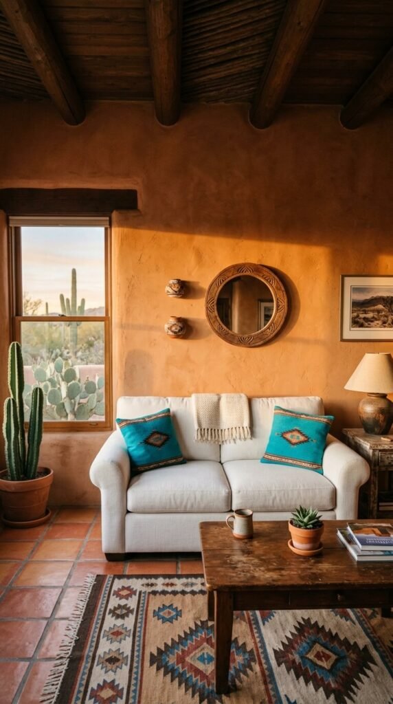
Adobe terracotta is the foundational color of Southwest design. It mirrors the color of hand-formed adobe bricks — warm, orange-tinged brown with a slightly matte, earthy finish. On a wall, it makes a room feel grounded and warm even without a single piece of furniture in it. Paint one wall in terracotta and the rest in white. The contrast is immediate and striking. Look for shades like Sherwin-Williams “Cavern Clay” or Benjamin Moore “Pueblo.” A single accent wall costs under $40 in paint. Pair with natural wood and white linen for a clean Southwest foundation.
2. Turquoise — The Stone Color That Defines the Southwest
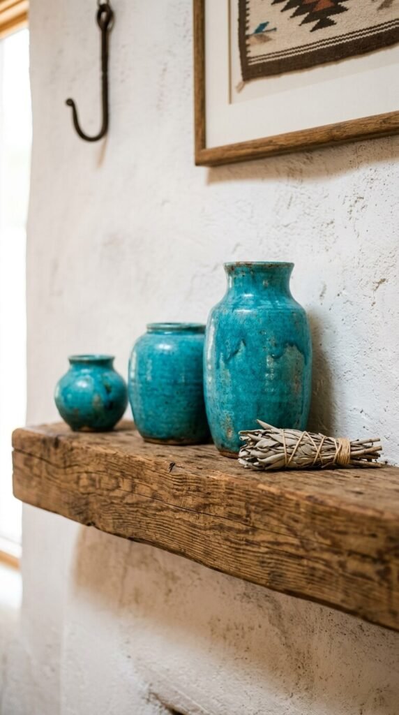
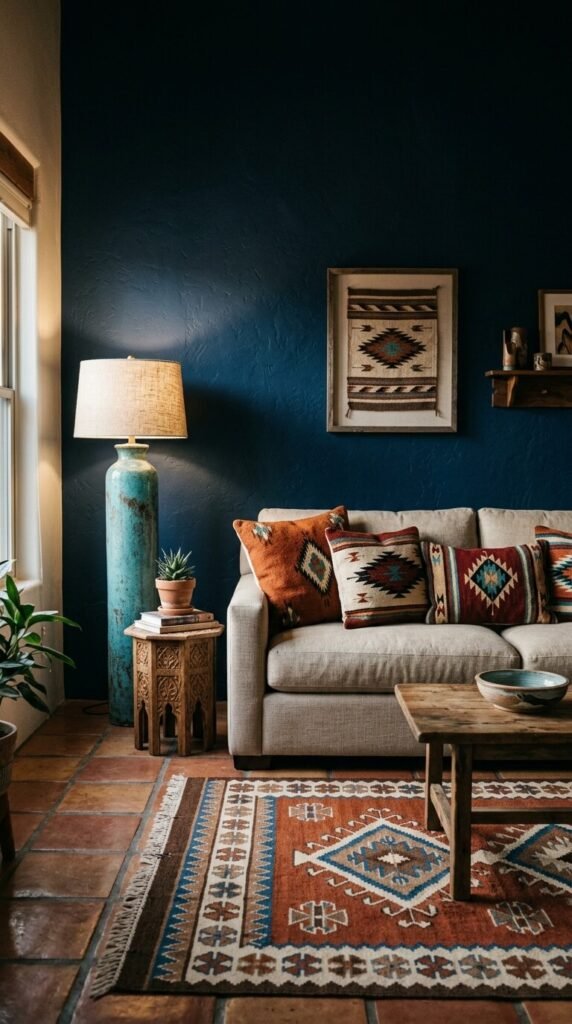
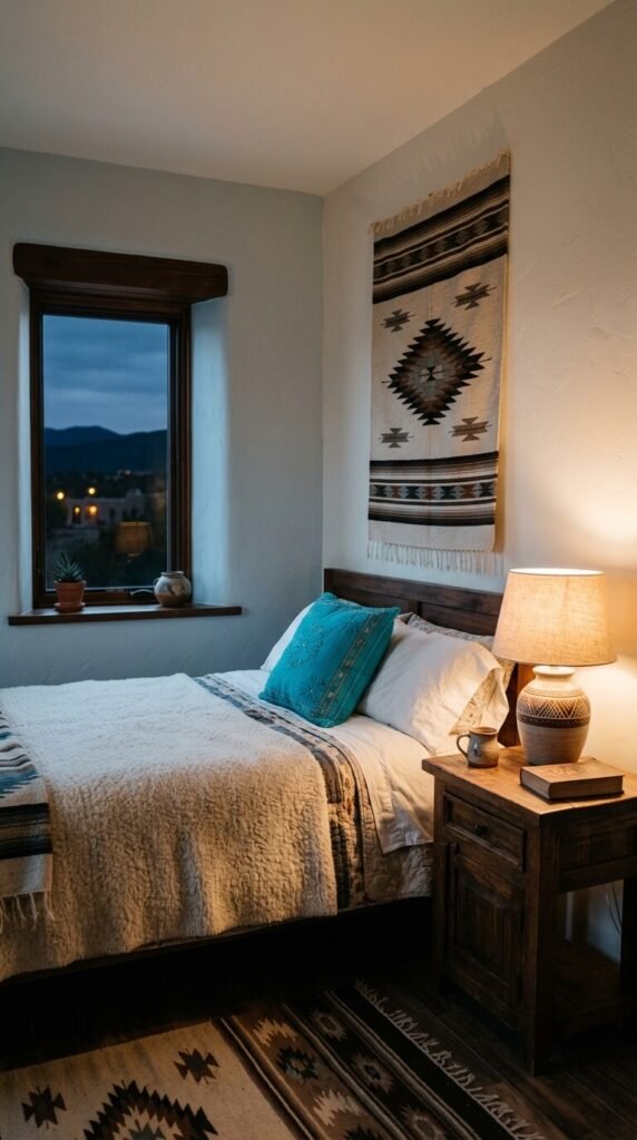
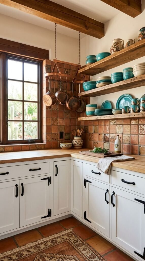
No color is more specifically Southwest than turquoise. It comes directly from the turquoise stone mined across New Mexico, Nevada, and Arizona — a stone sacred to Navajo and Pueblo peoples for centuries. In decor, turquoise works as an accent, not a base. Use it in ceramics, throw cushions, painted door frames, or cabinet hardware. A set of turquoise drawer pulls costs under $15 and transforms kitchen cabinets instantly. Look for the slightly green-leaning, slightly dusty version of turquoise — not the bright Caribbean tone. That warmth is what makes it feel desert-authentic.
3. Sandstone Beige — The Quiet Canvas Color
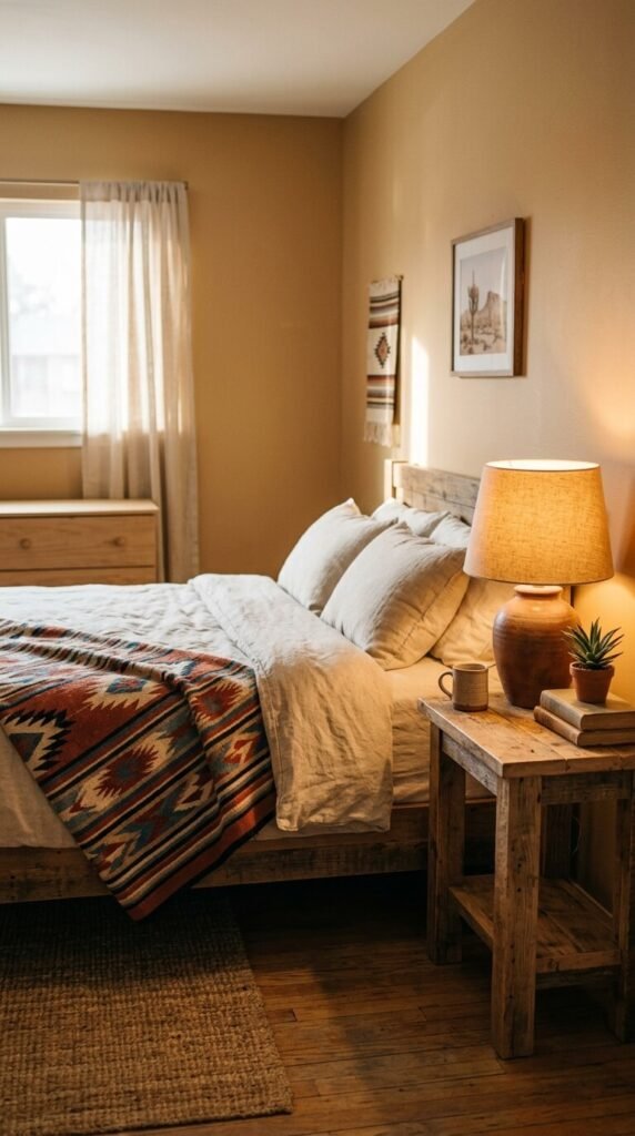
Sandstone beige is not plain beige. It is warm beige with a hint of pink and gold — the exact color of Entrada sandstone formations in Utah and Arizona. It reads as neutral but carries enormous warmth. Use it as a base wall color in bedrooms or hallways where you want calm rather than drama. It pairs with everything in the Southwest palette: terracotta, turquoise, rust, and deep brown all look rich against sandstone. Paint brands to look at: Benjamin Moore “Navajo White” or Sherwin-Williams “Accessible Beige” warmed slightly with a custom tint. Affordable and endlessly livable.
4. Burnt Sienna — The Canyon Wall Color
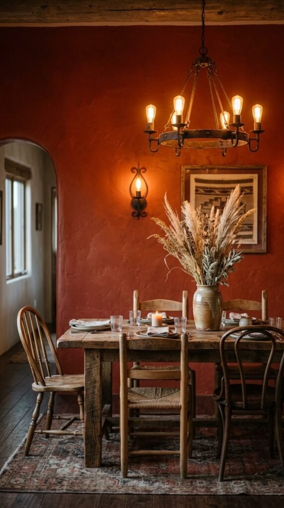
Burnt sienna sits deeper and redder than terracotta. It is the color of Antelope Canyon walls, of the iron oxide-stained rock faces that glow in late afternoon light. In a room, it creates immediate drama. Use it on a single dining room wall behind a rough wood table, or in a narrow hallway where the intensity works in a contained space. It is not a gentle color — it commands attention. Look for paint colors like Sherwin-Williams “Reddened Earth” or Benjamin Moore “Moroccan Red.” Budget tip: buy a sample pot ($5–$8) and live with a large swatch for three days before committing.
5. Sage Green — The Desert Plant Color
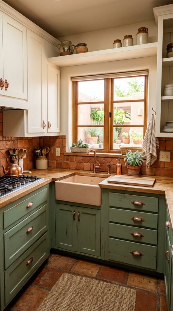
Sage green is the color of artemisia — the wild sage plant that covers desert mesas from Texas to California. It is grey-green, muted, and dry-looking rather than lush. That dryness is what makes it Southwest. Use sage green on kitchen cabinets, painted furniture, or as a full room color in a bathroom. It pairs naturally with terracotta, sandstone, and warm wood tones. Sherwin-Williams “Softened Green” and Farrow & Ball “Mizzle” are close matches. A painted side table or dresser in sage green costs under $30 in supplies and completely changes a room’s character.
6. Rust Orange — The Iron Soil Color
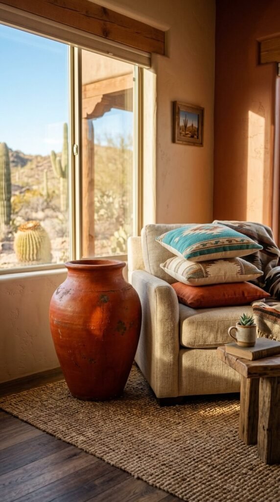
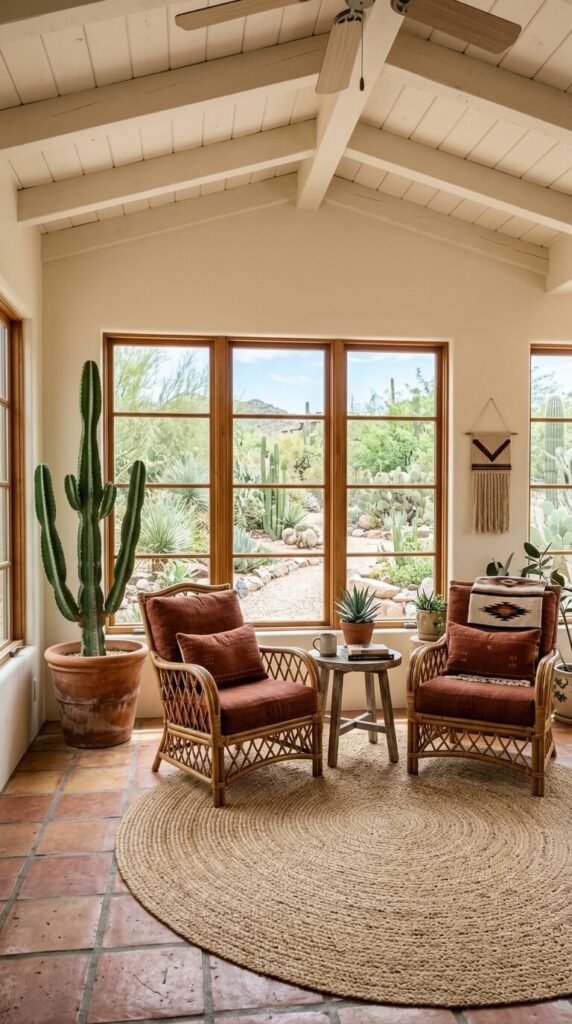
Rust orange is one step past terracotta — deeper, more saturated, and more obviously tied to iron-rich desert soil. Think of the red earth of Monument Valley or the soil of the Painted Desert. In decor, rust orange works best as an object color rather than a wall color. Large ceramic pots, wool throw blankets, or upholstered accent chairs in rust bring this color in without overwhelming a space. An oversized rust ceramic floor pot costs $30–$80 at garden centers or pottery studios. Place one in a corner with nothing else around it. It anchors the room immediately.
7. Warm White — Adobe Plaster’s Natural Finish
Not all whites are equal. Warm white — the specific slightly creamy, slightly peachy white of interior adobe plaster — is the background color of Southwest homes. It is not stark white and not yellow. It is the color of naturally pigmented whitewash over earthen plaster. In modern paint, look for Benjamin Moore “White Dove” or Sherwin-Williams “Alabaster.” These warm whites make terracotta, turquoise, and dark wood look even richer by contrast. They also hide wall texture imperfections beautifully. For a DIY plaster effect, apply a tinted joint compound skim coat over existing drywall for under $25 in materials.
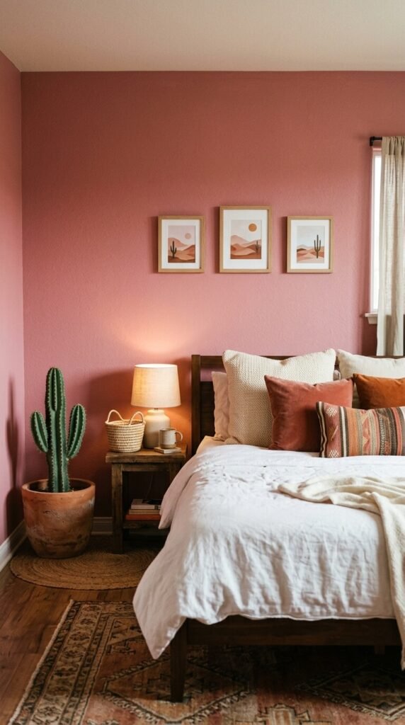
8. Desert Mauve — The Shadow-Side-of-Rock Color
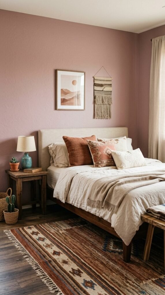
Desert mauve is the color that canyon rocks turn in shadow — a dusty, muted pink with grey undertones. It is deeply feminine without being soft, and deeply Southwest without being predictable. In bedrooms, desert mauve creates an enveloping quality — warm without being orange, cool without being cold. Pair it with cream linen, dark walnut wood, and turquoise ceramic accents. Paint reference: Sherwin-Williams “Rosy Outlook” or Benjamin Moore “Pale Mauve.” This is also a color that works beautifully on a single upholstered piece — a linen armchair or window seat reupholstered in mauve fabric for $15–$30 in material cost.
9. Navajo White — The Soft Neutral With Warmth
Navajo White is both a paint color name and a design concept — a warm off-white with a slight golden undertone that reads as neutral in most light conditions but glows amber at dusk. It is ideal for sunrooms, kitchens, and open-plan living spaces where you want airiness without coldness. Benjamin Moore’s “Navajo White” (OC-95) is the benchmark. It works as a full-room color — walls, ceiling, and trim all in the same tone — for a clean, cocoon-like Southwest effect. This monochromatic approach makes other colors in the room stand out sharply by contrast.
10. Ochre Yellow — The Desert Sunrise Color
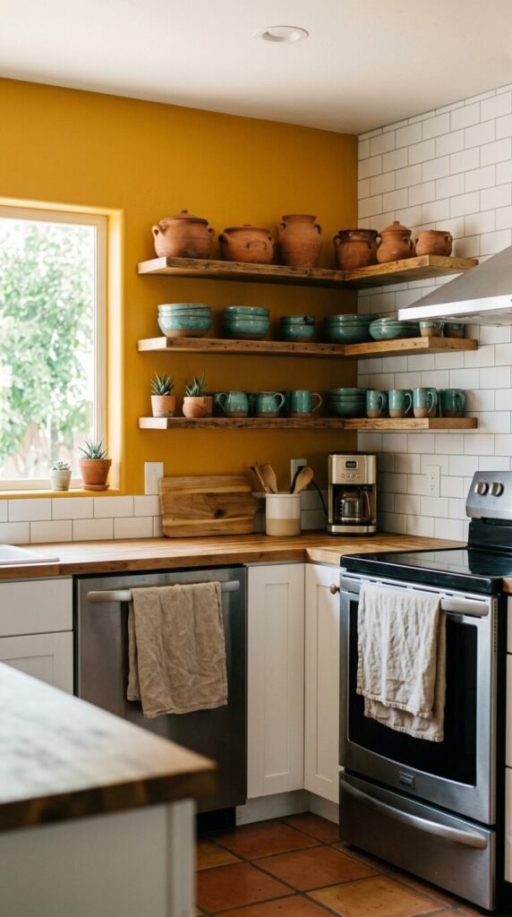
Ochre is the yellow of desert sunrise — warm, golden, and slightly earthy rather than pure yellow. It was one of the first pigments used by indigenous peoples across the Southwest in pottery, painting, and textile dyeing. In modern interiors, ochre works beautifully as a kitchen or dining room accent wall. It makes food look better and conversation feel warmer. Look for Farrow & Ball “Yellow Ground” or Sherwin-Williams “Afternoon” for accurate Southwest ochre. Ochre also works as a furniture paint — a wooden side table painted in ochre and sealed with matte varnish becomes a genuine design object for under $25.
11. Charcoal Brown — The Shadow of the Mesa
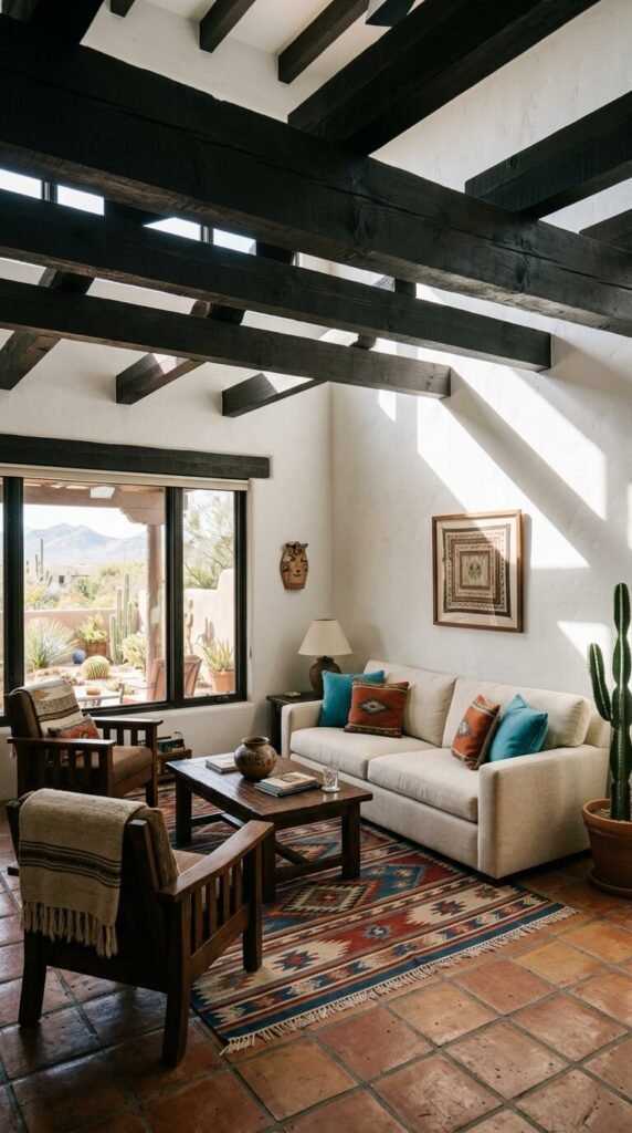
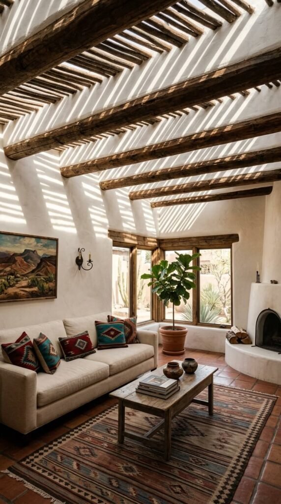
Charcoal brown — the color of weathered mesquite, burnt ocotillo wood, and scorched desert rock — is the dark anchor of the Southwest palette. In traditional adobe homes, it appears in exposed ceiling vigas (wooden beams), carved door frames, and hand-hewn furniture. Without this dark tone, a Southwest palette reads as pale and thin. Add charcoal brown through wooden furniture, painted ceiling beams (even faux ones), or a dark wood-stained floor. Faux beam wraps in dark walnut or chestnut finish are available at home improvement stores for $30–$80 and install without structural work.
12. Sky Blue — The High Desert Horizon Color
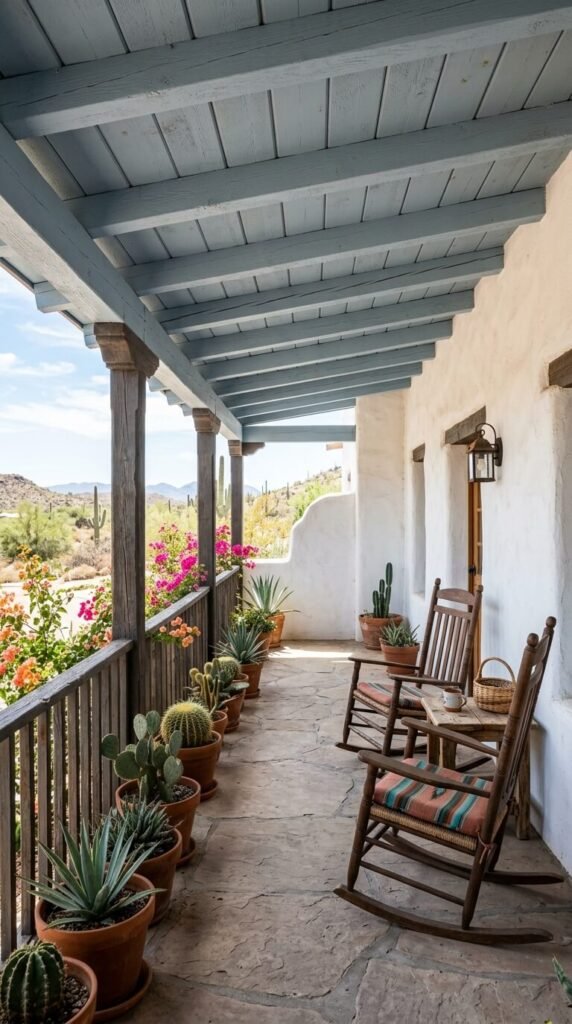
Sky blue in Southwest design is not baby blue or bright cobalt. It is the specific dusty, slightly grey-blue of the high desert sky at noon — lower in saturation, higher in atmosphere. Historically, Pueblo peoples painted porch ceilings in this tone to ward off insects and bad spirits. Today, it is called “haint blue” in some traditions. A porch ceiling painted in this color instantly reads as Southwest. Look for Sherwin-Williams “Moody Blue” or Benjamin Moore “Blue Lace” for the right muted quality. It also works beautifully on a bathroom ceiling or inside a painted cabinet.
13. Deep Burgundy — The Color of Dried Chiles
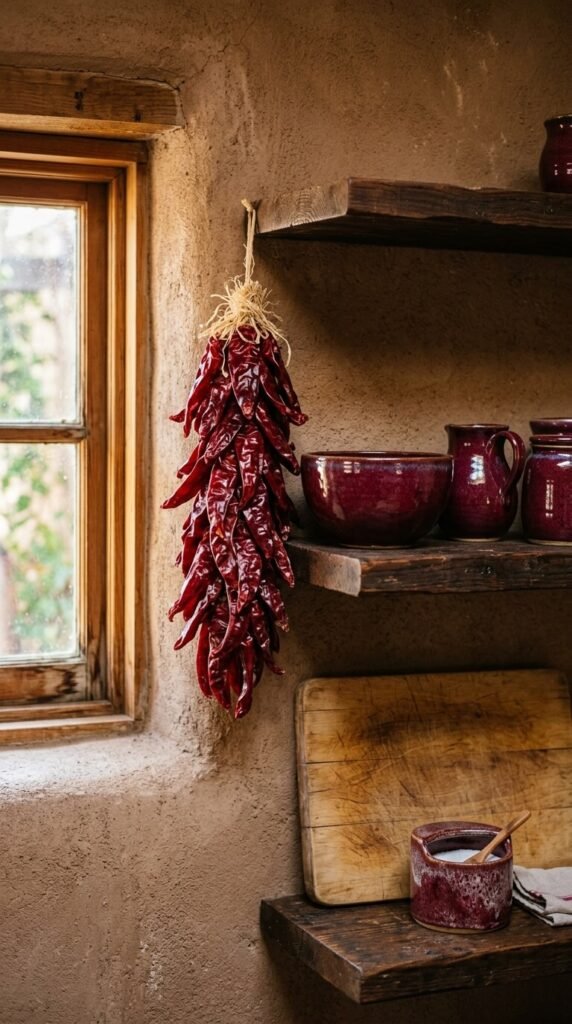
Deep burgundy comes from one of the Southwest’s most iconic food crops: the dried New Mexico red chile. This is a complex color — red with brown undertones, darkened almost to wine. It appears in traditional Pueblo pottery glazes, wool blanket dyes, and decorative tile work. In a modern home, burgundy works on upholstered furniture, accent cushions, and painted interior doors. A burgundy interior front door against an adobe exterior wall is a classic Southwest exterior moment. Use Sherwin-Williams “Antique Red” or Benjamin Moore “Cranberry Cocktail” for the right depth. A single painted door costs one quart of paint — around $20.
14. Sandstorm Grey — The Dry Wash Color
Sandstorm grey is not a cold grey. It is the color of dry desert silt — warm-toned, with beige and tan mixed into its base. Think of the color of a dust cloud seen from a distance, or the interior walls of a dry desert cave. This grey works in bathrooms and home offices where you want quiet, grounded calm without obvious color. It pairs with dark wood, terracotta tile, and turquoise accents — the full Southwest supporting cast. Paint reference: Sherwin-Williams “Accessible Beige” pushed toward grey, or Benjamin Moore “Revere Pewter” warmed with a drop of raw sienna.
15. Copper Tone — The Metallic Accent of the Desert
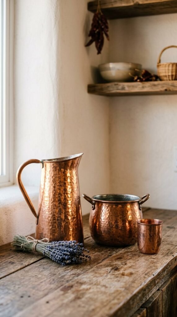
Copper is the metallic tone of the Southwest — found in ancient mining operations across Arizona and New Mexico, and used by indigenous craftspeople for centuries in jewelry, vessels, and decorative work. In modern interiors, copper appears as hardware, light fixtures, vessel sinks, and decorative pots. A set of copper cabinet pulls costs $15–$30 and immediately warms up painted cabinets. Three copper vessels in varying heights on a shelf create a striking vignette. Copper develops a natural patina over time — the darkening and greening is not damage, it is character. Do not over-polish it.
16. Prickly Pear Pink — The Cactus Fruit Color
The prickly pear cactus produces a fruit of vivid, warm pink — the same pink used to make natural dye in traditional Southwest textiles. As a wall color, prickly pear pink is muted rather than loud. It reads as dusty pink or pale mauve depending on the light, and it photographs beautifully at golden hour when it deepens toward rose. Use it in a bedroom or bathroom where it can work its softer magic. Look for Sherwin-Williams “Mellow Coral” or Benjamin Moore “Peach Sorbet” on the cooler, dustier end of their pink families. Pair with terracotta tile and cream linen.
17. Indigo — The Dye Color of Ancestral Weaving
Indigo has been a dyestuff in the Southwest since pre-Columbian times, used by Navajo and Hopi weavers to produce the deep blue-black tones still seen in historic textile collections. As a wall color, deep indigo is one of the most dramatic moves in Southwest design. It works powerfully in a living room or study — especially at night when it becomes almost black and makes warm lamp light glow like firelight against it. Paint reference: Sherwin-Williams “Indigo Batik” or Farrow & Ball “Hague Blue.” Pair with warm copper, natural wood, and cream linen to prevent the room from feeling cold.
18. Dried Grass Gold — The Late Summer Mesa Color
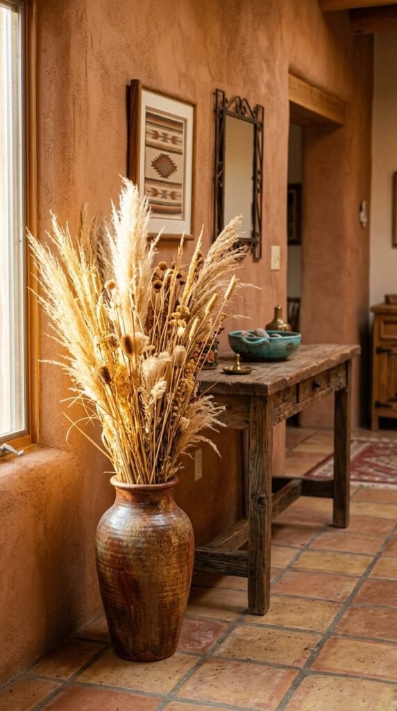
By late summer, the grasses of the desert plateau dry to a warm golden straw color — not yellow, not tan, but the exact color between them. This is a color you bring in through texture rather than paint. Dried grass gold enters a room through natural dried arrangements, woven seagrass furniture, jute rugs, and rattan baskets. A large floor vase of dried desert grasses — pampas, bear grass, or fountain grass — costs $15–$30 from a craft store or florist. It adds height, movement, and this specific warm gold tone that no paint can quite replicate.
19. Moonstone White — The Night Sky Reflector
Moonstone white is the color that white adobe walls turn at dusk — not quite white, not quite grey, with a slight blue shift from the darkening sky. In paint, this means a white with cool, slightly blue-grey undertones that shows its character only in specific light conditions. During the day it reads as clean white. At dusk and night, it turns atmospheric and cool. Benjamin Moore “Chantilly Lace” is bright by day but shifts beautifully in evening light. Use this on bedroom walls specifically for the way it changes between morning and night. The transformation is part of the design.
20. Weathered Wood Brown — The Vigas and Corbels Color
Weathered wood brown is not a paint choice — it is a material choice. The aged, sun-bleached, slightly silvered brown of old wood is irreplaceable in Southwest interiors. Exposed wooden ceiling beams, hand-carved corbels, rustic door frames, and raw wood furniture all carry this color. If you cannot add structural wood elements, look for weathered wood-finish furniture at salvage yards and thrift stores. A weathered wood console table runs $40–$120 secondhand. You can also apply a grey-brown wood stain over new pine furniture ($12–$20) to approximate the aged desert wood tone immediately.
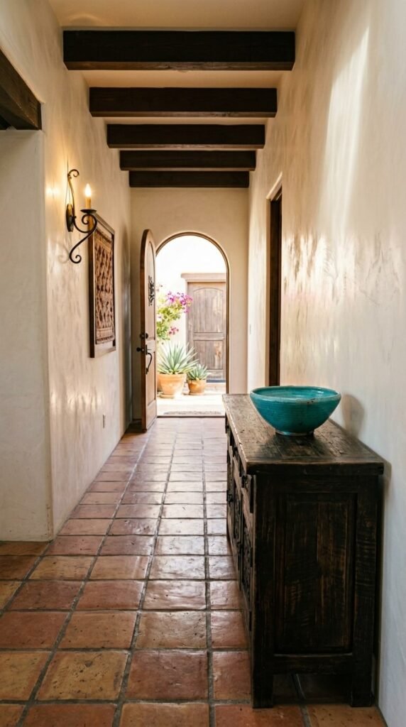
21. Turquoise Teal — The Deeper Stone Variation
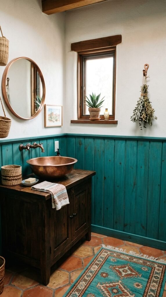
Turquoise teal is the deeper, greener sibling of classic turquoise. Where standard turquoise reads bright and airy, teal pulls toward the forest — darker, richer, more grounded. In Southwest design, this deeper tone appears in old Navajo jewelry stones, antique pottery glazes, and painted woodwork in historic New Mexico homes. Use turquoise teal on a bathroom vanity, painted wainscoting, or the interior of a bookcase. It pairs powerfully with copper hardware and terracotta tile. Sherwin-Williams “Peacock Plume” or Benjamin Moore “Teal Ocean” hit this specific tone. One quart covers a small vanity completely for around $20.
22. Raw Umber — The Desert Shadow Color
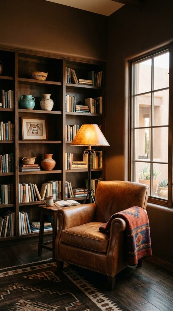
Raw umber is the dark brown of desert cave walls and iron-stained rock faces in shadow. It is a complex brown — cool in undertone, almost greenish in certain lights, and deeply grounding. Used as a full room color in a study or library, raw umber creates an immediate sense of enclosure and focus. It is the color you want around you when reading or working. Pair with cognac leather, warm amber light, and turquoise ceramic accents. Look for Sherwin-Williams “Umber” or Benjamin Moore “Antique Brown.” This color requires a primer coat first to achieve full depth — budget two quarts and one afternoon.
23. Lavender Dusk — The Desert After-Storm Sky
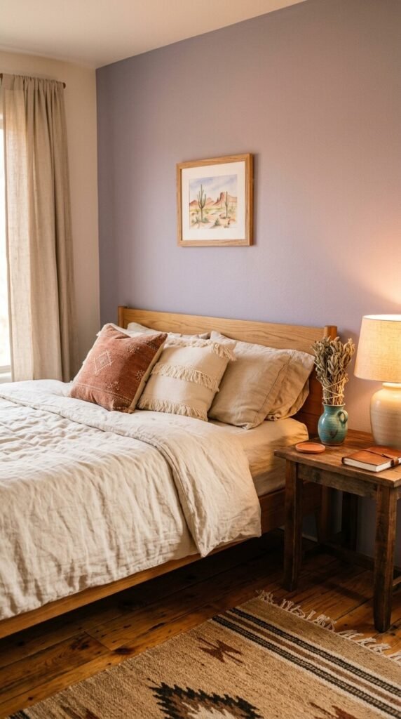
After a summer monsoon, the New Mexico sky turns a specific dusty lavender-grey — pink and purple mixed with the grey of receding storm clouds. This is the rarest color in the Southwest palette and the most surprising. Used on a bedroom accent wall, dusty lavender creates a quiet, dreamy quality without looking feminine or conventional. It works because of what surrounds it: terracotta tile, warm linen, dark wood, and dried botanical accents keep it grounded in the desert. Look for Sherwin-Williams “Enigma” or Benjamin Moore “Silver Lilac” for the right muted, grey-leaning lavender.
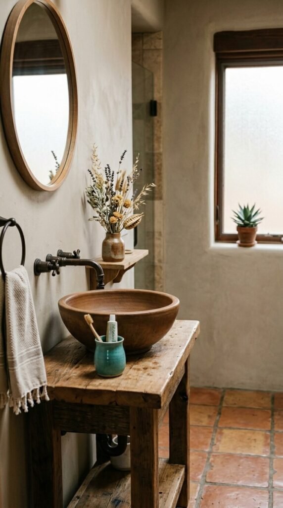
24. Yucca Green — The Spike Plant Color
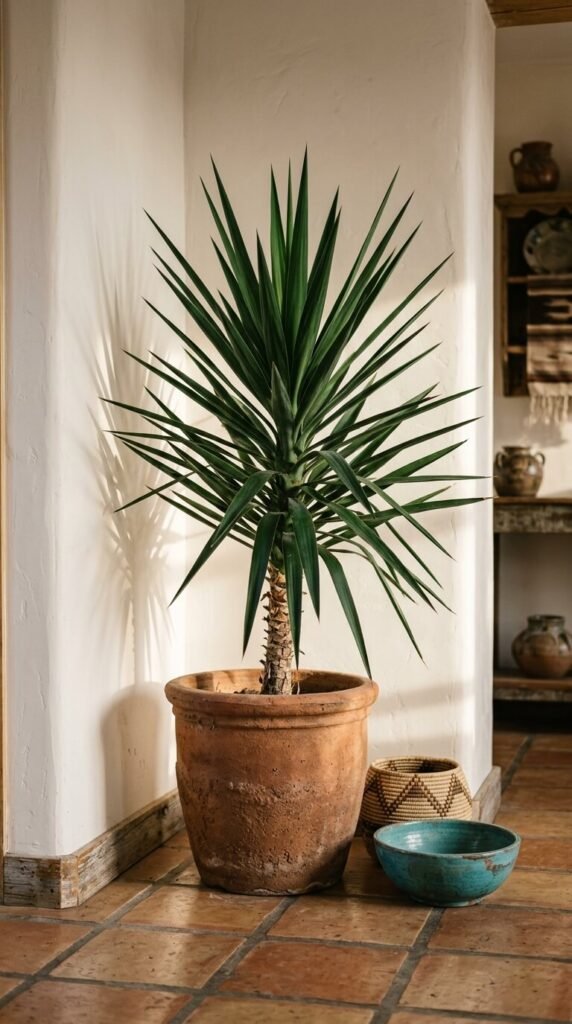
Yucca green is not a paint color — it is a living color. The dark, blue-green of yucca, agave, and other desert spiky plants is best introduced through actual plants rather than paint or fabric. A large yucca or agave in a rough clay pot brings this color and its graphic architectural form into the room simultaneously. Yucca plants are among the hardiest indoor options available — they tolerate neglect, low water, and indirect light. A medium yucca plant costs $20–$45 at garden centers. Place one in a corner with nothing else around it. The shape alone earns its place.
25. Black Iron — The Forge Color of Southwest Hardware
Matte black iron is the hardware and fixture color of Southwest design. Wrought iron grilles, forged iron light fixtures, black iron cabinet pulls, and painted iron window frames all carry this color. It provides the sharp dark contrast that keeps a Southwest palette from looking washed out. Replace brass or chrome hardware with matte black iron equivalents — a full set of cabinet pulls costs $20–$50 and the transformation is immediate. Pair black iron light fixtures with Edison bulbs for the warm, slightly industrial quality found in historic Santa Fe and Tucson interiors. This is the detail that makes the whole palette feel intentional.
Conclusion
The Southwest palette is not a collection of random colors. It is a system — one built over centuries from the specific light, soil, stone, and plant life of a very particular landscape. Terracotta and sandstone are the foundations. Turquoise and copper are the accents. Dark wood, rust, and matte black are the structure. Sage, ochre, and mauve fill the space between. When you use these colors together, even in small doses — a painted wall here, a ceramic vessel there, a wool throw on the sofa — the room starts to feel like somewhere. Not a showroom. Not a catalog. A place that knows where it is and what it is made of. Start with one color. Let it tell you what it wants beside it. The desert palette builds itself, one earthy layer at a time.