
Neutral decor is not the absence of a design decision — it is a very deliberate one. When chosen carefully, a neutral palette creates rooms that feel genuinely calm, spatially generous, and timeless in a way that trend-driven colour schemes rarely sustain. The key is understanding that “neutral” does not mean beige painted on every surface and left to do the work alone. It means building a layered composition of warm and cool tones, varied textures, natural materials, and considered proportions — all within a tightly controlled tonal range. These 26 sophisticated neutral decor palettes give you practical, specific ways to achieve that calm, considered quality in every room of your home.
1. Warm Greige Walls With Linen Upholstery
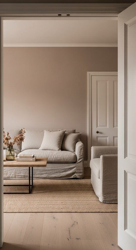
Greige — a warm, balanced tone between grey and beige — is the single most reliable neutral wall colour for creating a sophisticated, calming room. It reads differently across the day: cooler in morning light, warmer in afternoon sun. Pair it with natural linen upholstery in oat, stone, or pale sand for a layered tone-on-tone effect that feels considered rather than plain. Linen wrinkles slightly and develops texture with use — this is part of its appeal rather than a flaw. Budget tip: linen-effect polyester blends cost a fraction of pure linen and photograph nearly identically.
2. Warm White and Raw Wood Living Room
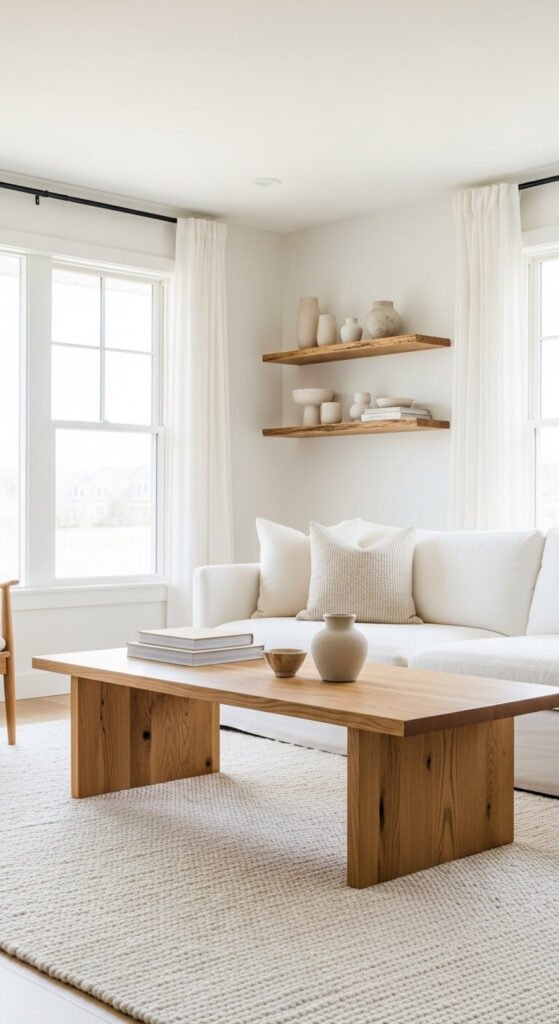
Warm white walls — slightly cream rather than cool or blue-white — combined with raw, unfinished wood furniture creates a living room palette that is simultaneously bright and warm. The warmth comes entirely from material rather than colour. Use solid oak, ash, or pine with a natural oil finish rather than a dark stain — the natural grain and honey tones are what create the warmth. Avoid matching all the wood to the same tone — mix slightly different wood species and finishes for a more organic, layered result. Budget tip: unfinished pine furniture from flatpack suppliers can be oiled at home for a beautiful natural result.
3. Layered Cream and Ivory Bedroom
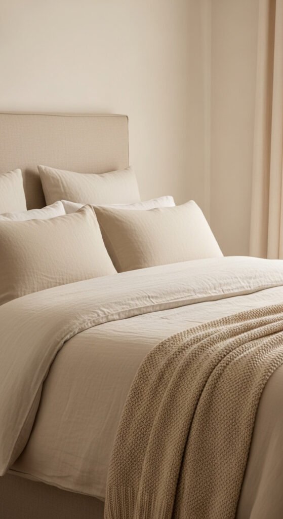
A bedroom built entirely from layered cream and ivory tones — where every textile is a slightly different shade within the same warm white family — creates a deeply calming sleeping environment. The visual interest comes from texture variation rather than colour contrast: linen, knitted cotton, waffle weave, and smooth percale all catch light differently and create a quietly rich layered effect. Use at least four different textures in the same tonal family for the most sophisticated result. Budget tip: mix bedding from different affordable retailers — slight tonal variations between brands actually enhance the layered quality of this scheme.
4. Terracotta and Stone Tonal Palette
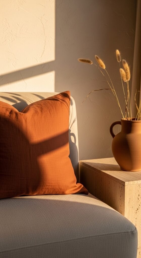
Terracotta and stone work as neutrals — not as accent colours — when used within a consistently warm, muted tonal range. Terracotta at low saturation reads as a warm earth neutral rather than a bold statement colour. Pair with stone grey, raw plaster white, and dried grass tones for a palette that feels grounded and organically earthy. This palette works especially well in living spaces and dining rooms where warmth and groundedness are more important than brightness. Budget tip: terracotta paint in a low-sheen finish is widely available from standard paint ranges and transforms a room at standard wall paint cost.
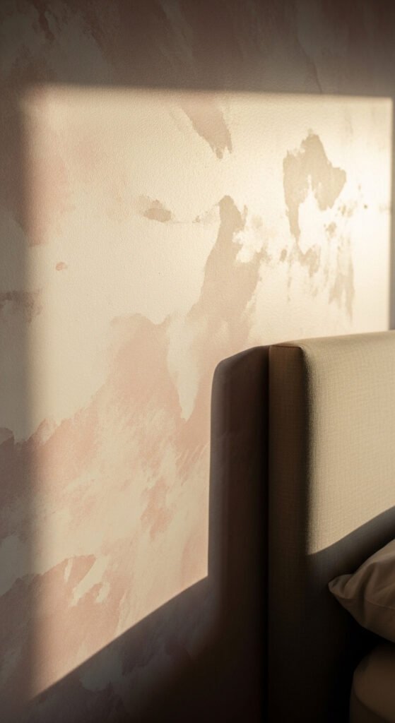
5. Plaster Pink and Warm Concrete Bathroom

Plaster pink — a pale, chalky, warm rose tone rather than a saturated pink — reads as a sophisticated neutral in bathroom and bedroom spaces. It flatters skin tones, creates warmth without heaviness, and pairs beautifully with warm concrete tiles, brushed brass fittings, and cream linen textiles. Use it as a wall colour with a contrasting texture — a limewash or clay-effect paint application enhances the plaster-like quality. Budget tip: limewash effect paint is available from most paint retailers at standard paint pricing — the chalky texture effect is achieved with a simple application technique, no specialist tools required.
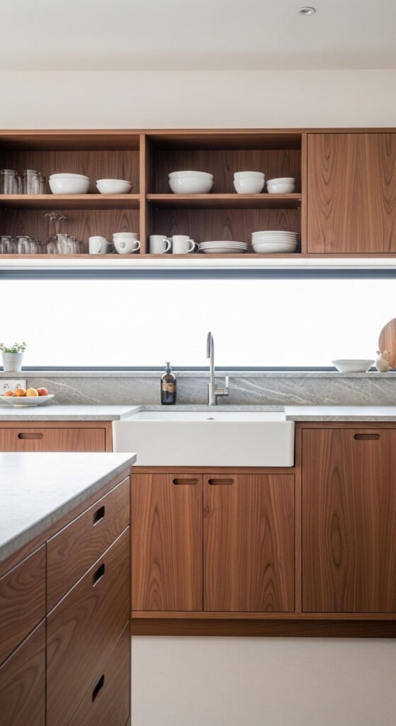
6. Sage Green and Off-White Kitchen
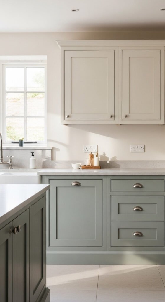
Sage green at low saturation — grey-toned and muted — reads as a neutral in kitchen and living room settings. It carries the warmth of green without the boldness of a full colour statement. Pair sage lower cabinets with off-white upper cabinets and a pale stone countertop for a calm, biophilic kitchen palette that feels both warm and clean. Brushed nickel or unlacquered brass fittings complement this palette well without competing with it. Budget tip: cabinet paint in sage tones is widely available — painting existing cabinet doors is far more affordable than replacing them entirely.
7. Natural Linen Curtains Floor to Ceiling
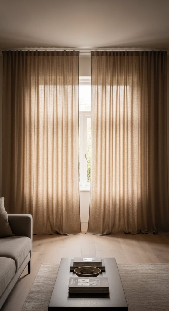
Floor-to-ceiling linen curtains in undyed natural fibre are one of the single most impactful investments in a neutral room. They soften hard architectural lines, filter light warmly, and add a large-scale textile texture that makes a room feel considered and finished. Hang the rod as close to the ceiling as possible and let the curtains puddle slightly on the floor. The pooling fabric adds softness and a slightly relaxed, livable quality. Budget tip: curtain-weight natural linen fabric bought by the metre from fabric suppliers is substantially cheaper than pre-made linen curtains of equivalent quality.
8. Jute and Sisal Area Rugs
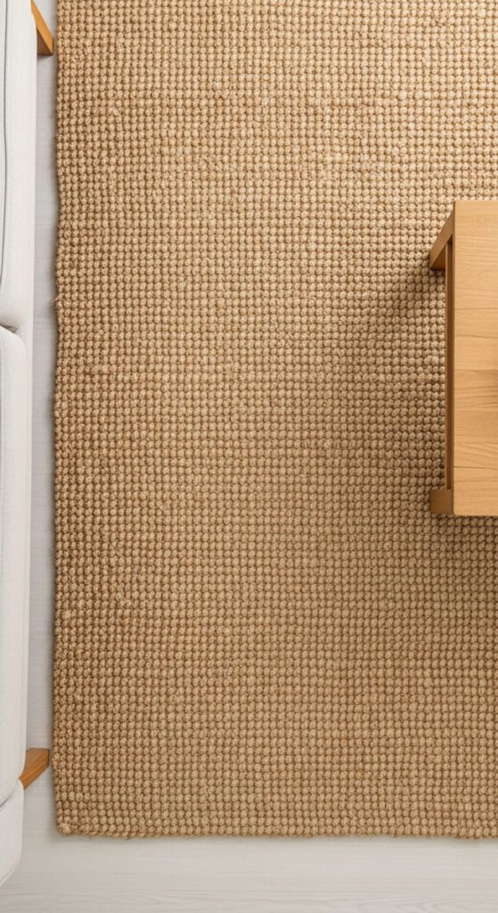
Jute and sisal rugs are the most affordable natural fibre flooring option and one of the most effective textural elements in a neutral room. The natural variation in fibre colour — warm tan, honey, and oat — creates tonal richness without any pattern or colour. A herringbone or basketweave jute rug adds more visual interest than a plain flat-weave. These rugs wear well in living rooms and hallways but are less comfortable underfoot in bedrooms — a sheepskin or wool layer on top solves this. Budget tip: jute rugs from discount home stores are genuinely good quality and cost a fraction of wool or cotton alternatives.
9. Raw Plaster Wall Finish
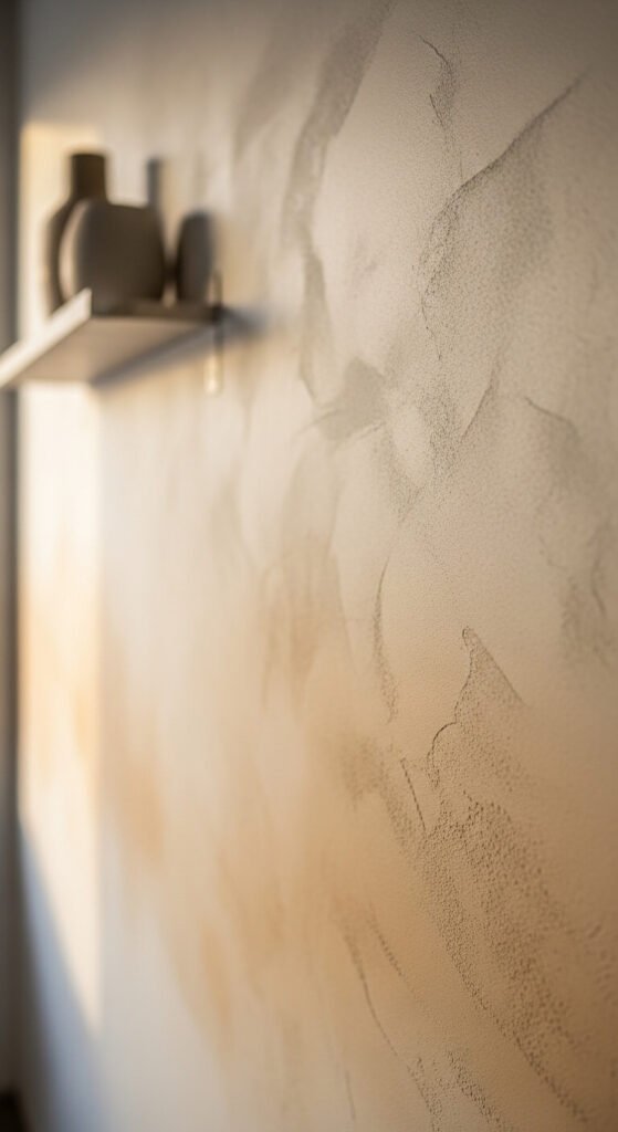
Raw plaster wall finishes — applied as a final layer over standard painted walls using venetian plaster, clay plaster, or limewash techniques — create a warm, textured neutral surface that flat paint cannot replicate. The organic variation in surface tone and the matte depth of natural plaster materials make walls feel alive rather than flat. Venetian plaster and clay-based wall finishes can be applied DIY over a weekend with basic tools. Budget tip: limewash paint from standard paint retailers achieves a similar textural organic quality at the cost of a standard paint and requires minimal application skill.
10. Warm Sand and Cream Open Plan
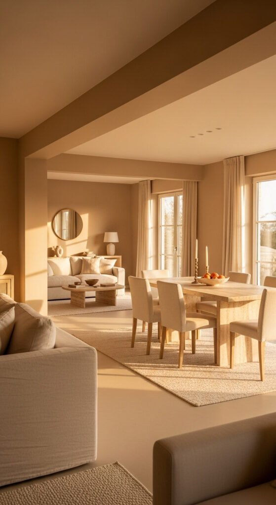
Sand-toned walls across an open-plan space — a warm beige with a golden rather than grey undertone — create visual consistency across connected zones without making the space feel monotonous. Use varying textures within the same sand-cream palette in each zone: rough travertine in the dining area, smooth linen upholstery in the living zone, and woven wool at the floor. The tonal consistency allows the zones to read as one cohesive space rather than separate rooms that happen to be connected. Budget tip: testing paint in sand tones across a full wall before committing saves expensive mistakes — undertones shift dramatically in different light conditions.
11. Stone Grey and Warm White Minimalism
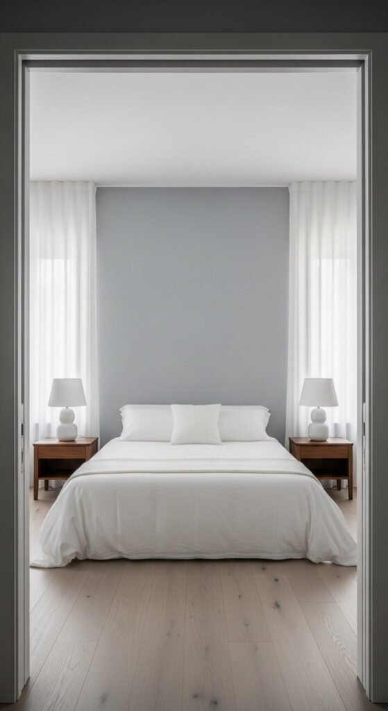
Stone grey walls with warm white bedding and furniture create a serene, monastic bedroom palette that feels both calm and sophisticated. The grey should have a warm, slightly blue-grey or taupe undertone rather than a cool blue-grey — cooler greys can feel clinical in bedroom settings. White bedding in a good-quality natural fibre like linen or percale cotton against stone grey walls reads as clean and considered. This palette works particularly well in north-facing rooms where cooler natural light can make warmer neutrals feel slightly muddy. Budget tip: stone grey paint is available at all price points — mid-range paint ranges offer reliable coverage with good depth.
12. Natural Rattan and Neutral Linen
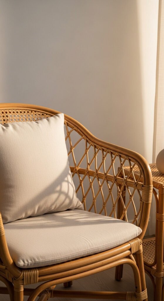
Natural rattan furniture — chairs, shelving, pendant lights, and side tables — introduces organic texture and warmth into a neutral space without adding colour. The natural tan and honey tones of rattan sit within a warm neutral palette without disrupting it. Pair with cream linen upholstered pieces and pale oak flooring for a layered, textural scheme that feels relaxed and livable. Rattan is widely available at accessible price points from mass-market home retailers. Budget tip: rattan pendant light shades are one of the most affordable texture-adding elements available — a single rattan pendant can transform the quality of a room’s lighting and atmosphere.
13. Undyed Wool Textiles and Natural Fibre Throws
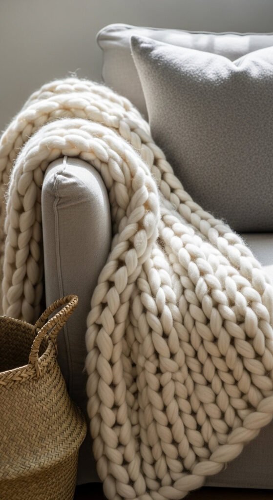
Undyed, natural wool textiles carry their colour variation directly from the raw fibre — off-white, pale grey, and warm cream occurring naturally within the yarn. This creates a textural richness that dyed neutrals can’t replicate because the colour is in the material itself rather than applied to it. Use undyed wool throws, cushions, and blankets layered across linen upholstery for a deeply organic, tactile neutral scheme. Budget tip: undyed natural wool yarn products from independent spinners and weavers on craft marketplaces are often very affordable and significantly more interesting than mass-market throw alternatives.
14. Wabi-Sabi Neutral With Imperfect Ceramics
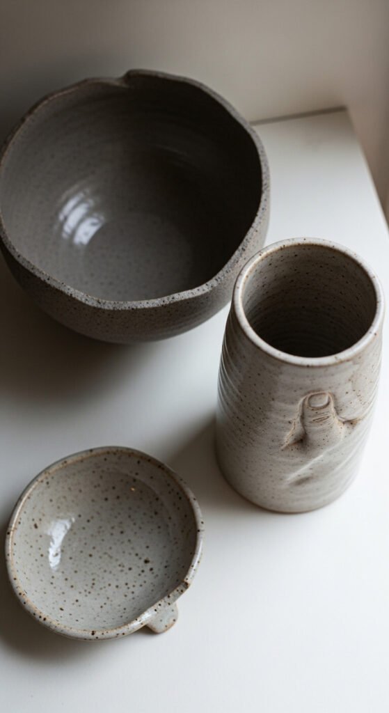
Wabi-sabi — the Japanese aesthetic of beauty in imperfection and impermanence — translates directly into a neutral decor palette through the use of rough-fired ceramics, naturally aged materials, and organic forms. Hand-thrown ceramics with uneven rims, visible thumb marks, and rough textures are the physical expression of this philosophy. These pieces add depth and authenticity to a neutral shelf or surface. Look for pieces from local ceramicists at craft markets or art school sales. Budget tip: seconds from ceramic artists — pieces with minor faults that don’t affect function — are often sold at significant discounts and are visually indistinguishable in a styled setting.
15. Travertine and Warm Plaster Bathroom
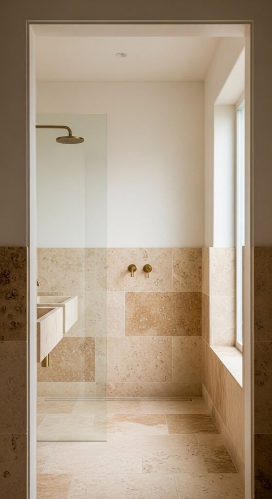
Travertine tiles — with their characteristic cream, tan, and brown variation and naturally occurring fossil and veining pattern — create one of the most calming and sophisticated neutral bathroom surfaces. Pair with warm plaster-effect paint above the tile line and brushed brass fittings for a complete palette. The warm organic tones of travertine against plaster white walls and brass metal create a spa-like atmosphere. Budget tip: travertine-effect large-format porcelain tile is available at a fraction of the cost of natural travertine and requires less maintenance. The visual effect is very close at normal viewing distances.
16. Soft Mushroom and Taupe Dining Room
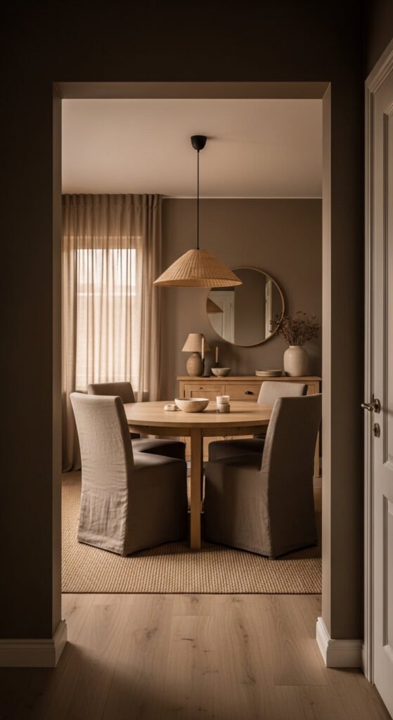
Mushroom — a warm, mid-depth grey with brown and purple undertones — creates a cocooning, sophisticated dining room that feels intimate and considered. It is one of the most characterful of all the neutral tones. Pair with taupe linen dining chairs, natural oak furniture, and a woven shade pendant for a complete palette. Mushroom works particularly well in dining rooms where lower light levels and intimacy are desirable. The depth of the tone makes it more appropriate for smaller rooms or rooms with lower ceilings where a pale neutral might feel unanchored. Budget tip: sample test mushroom tones against your specific light conditions before committing — undertones shift dramatically.
17. White Oak Flooring and Warm White Walls
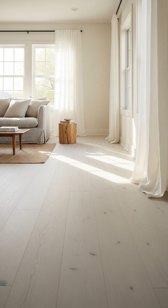
Wide-plank white oak flooring has a pale, almost bleached quality that reflects light upward and makes rooms feel larger and more luminous. Pair with warm white walls — slightly cream, never cool — to prevent the overall palette from feeling cold. The combination of light oak and warm white creates a Scandinavian-influenced neutral scheme that photographs beautifully and feels consistently calm at all times of day. Budget tip: engineered white oak flooring offers the same visual quality as solid hardwood at a lower price point and with better dimensional stability. Click-lock engineered systems are accessible DIY installations.
18. Dried Botanical Arrangements in Natural Tones
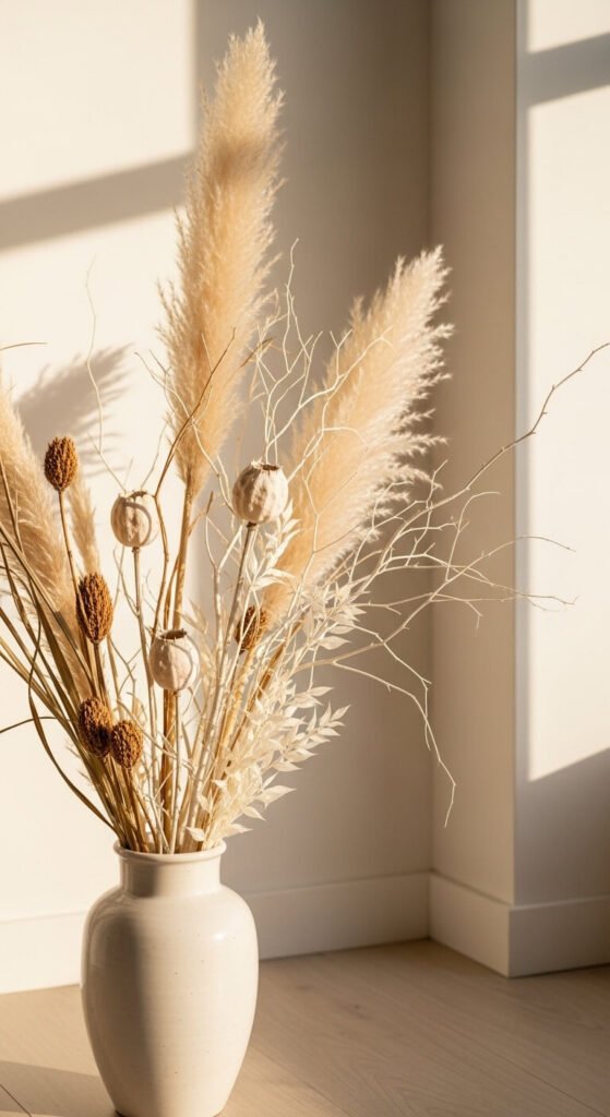
Dried botanical arrangements — pampas grass, bleached seed pods, dried branches, and preserved leaves — maintain the warmth and organic quality of fresh botanicals without the maintenance. In a neutral room, use pieces in natural undyed tones: pale cream pampas, bleached branches, tan seed heads, and ivory preserved florals. Avoid dyed dried botanicals, which can look artificial. A tall floor vase in the corner of a living room with a generous pampas arrangement creates a significant organic architectural presence. Budget tip: pampas grass, dried seed pods, and branches collected from outdoor environments cost nothing and are often more beautiful than purchased alternatives.
19. Limewash Painted Feature Wall
Limewash paint creates a characteristic mottled, layered surface effect — slightly darker in recesses and lighter on raised areas — that gives a wall a centuries-old, organically aged quality. It is one of the most affordable ways to add significant textural depth to a neutral room. Apply with a large, natural-bristle brush in overlapping crosshatch strokes — no special skills required. Available from most paint retailers. The effect works particularly well on plaster walls with slight surface irregularity rather than perfectly smooth drywall. One litre covers approximately 10 square metres with the typical two-coat application.
20. Camel and Cream Tonal Living Room
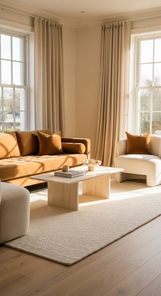
Camel — a warm, golden tan that sits between beige and ochre — used as the dominant upholstery tone against cream walls, cream textiles, and pale oak creates a golden-warm living room palette with genuine sophistication. Camel velvet upholstery specifically has a richness and texture that reads as luxurious without being heavy. Pair with cream wool rugs, ivory linen curtains, and pale marble surfaces for the most consistent tonal result. Budget tip: camel velvet cushion covers are significantly more affordable than a full camel velvet sofa — introduce the tone gradually through textiles before committing to larger upholstered pieces.
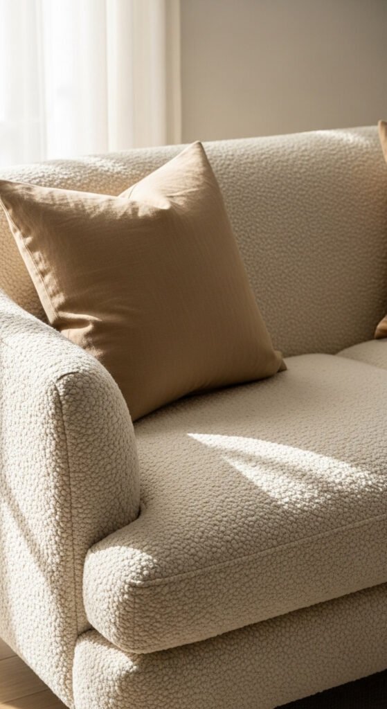
21. Neutral Textural Throw Pillow Layering
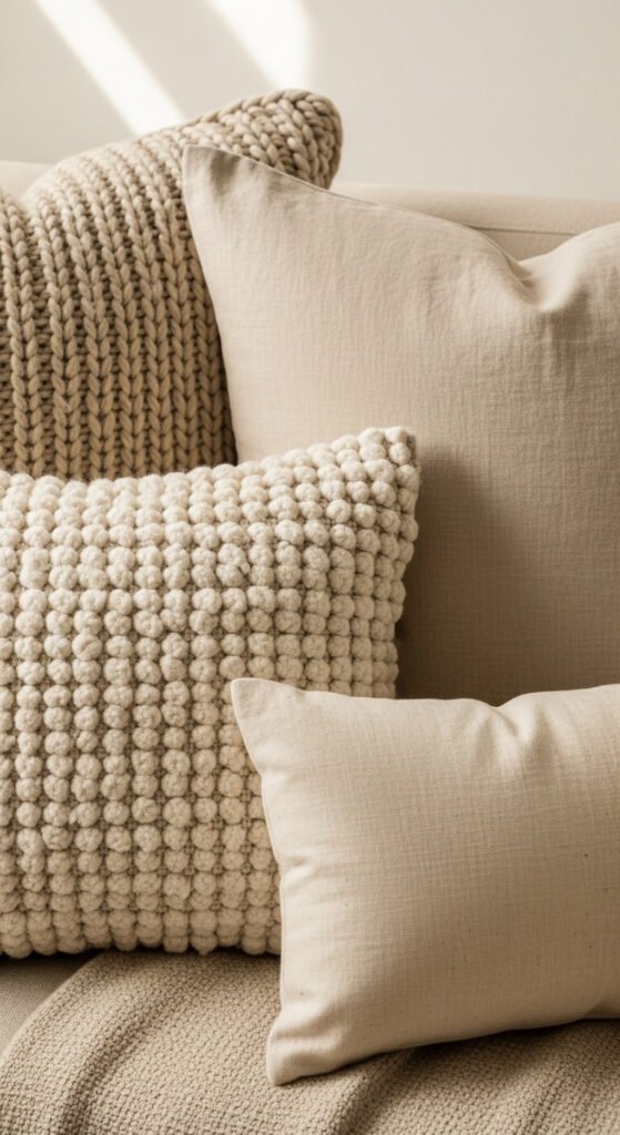
Throw pillow layering in a consistent neutral tonal palette creates significant visual richness through texture variation alone — no colour contrast required. Combine chunky knit, smooth linen, boucle, and plain cotton in the same warm cream-to-taupe family. Use five or seven pillows rather than even numbers for the most natural, organic arrangement. Vary sizes — square, rectangular, and bolster shapes — for the most visually interesting grouping. Budget tip: pillow covers in natural textiles are widely available from discount home stores — buy covers separately from inexpensive inserts for the most budget-friendly approach to layered pillow styling.
22. Natural Stone and Wood Kitchen
Natural stone countertops and warm wood cabinet fronts create a kitchen palette that is calm, warm, and organically grounded without relying on any applied colour. The natural variation in stone veining and wood grain provides visual interest that manufactured surfaces cannot replicate. Use the same wood tone across lower cabinets and open shelving for visual consistency. Pale grey or white stone on the counter surface provides the light contrast that prevents the palette from feeling too dark or heavy. Budget tip: stone-effect porcelain surfaces and thermofoil wood-effect cabinet fronts offer similar visual results at significantly reduced cost.
23. Undyed Cotton and Canvas Accents
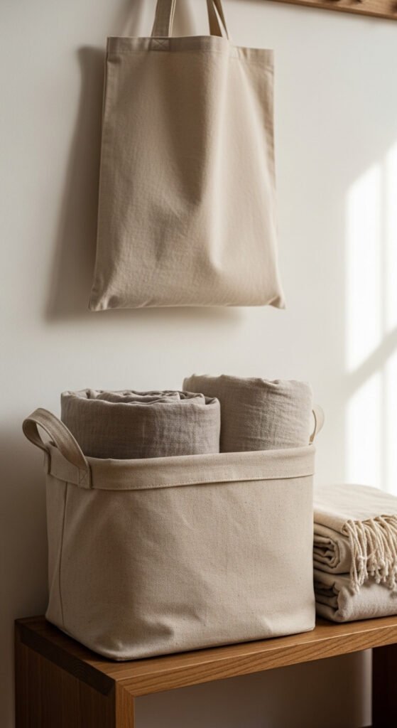
Undyed cotton and canvas accessories — storage baskets, bags, cushions, and throw covers in their natural unbleached state — contribute a warm, raw, organic quality to a neutral room that dyed neutrals don’t quite replicate. The natural off-white and warm cream of undyed cotton has an inherent warmth. Use canvas storage baskets, natural cotton rope organisers, and undyed linen bags as functional accessories that simultaneously contribute to the neutral palette. Budget tip: undyed cotton canvas products are consistently among the cheapest fabric accessories available — their natural state is their aesthetic value rather than a compromise on more expensive coloured alternatives.
24. Soft Clay and Warm Terracotta Bedroom
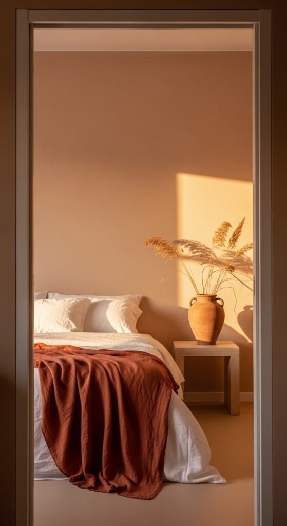
Soft clay wall paint — a pale, muted earthy tone with warm pink-red undertones — creates a bedroom that feels deeply calming and grounded. It is warmer than a standard neutral but lower in saturation than a statement colour. Layer with white bedding, a terracotta linen throw, and raw ceramic objects to build the earthy palette. This combination works particularly well in bedrooms that receive warm afternoon light — the light amplifies the warmth of the clay tone and creates a deeply peaceful evening atmosphere. Budget tip: clay-based wall paint is now available from several paint ranges at standard pricing, with authentic mineral pigment formulations.
25. Boucle Upholstery in Cream and Oat
Boucle fabric — a tightly looped, textured weave with a characteristic nubby surface — is one of the most tactilely interesting and visually warm upholstery options in a neutral palette. A cream or oat boucle sofa or accent chair adds significant textural depth to a neutral room that smooth linen or cotton cannot provide. The looped surface catches and diffuses light, creating a warm, slightly matte glow. Boucle works particularly well in living rooms and reading corners where tactile quality enhances the experience of the space. Budget tip: boucle accent chairs are considerably more affordable than full sofas and have a strong visual impact.
26. Neutral Scandi-Inspired Dining Room
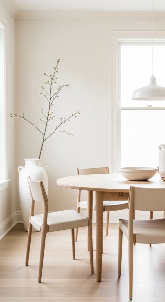
Scandinavian-inspired neutral dining rooms operate on a strict material palette: light oak, warm white, undyed leather or linen, and simple ceramic objects. Colour is absent entirely — the sophistication comes from the quality of proportion, the purity of form, and the material honesty of each piece. A round table encourages conversation and avoids the formality of rectangular dining. Organic, simple forms in furniture and accessories reinforce the calm quality of the scheme. Budget tip: simple round pine dining tables can be painted or oiled at home to achieve a light, Scandi-appropriate tone without the cost of solid oak alternatives.
Conclusion
Neutral decor works when it is layered — when tone, texture, material quality, and proportion are considered together rather than relying on a single beige paint to carry the whole room. Every palette on this list operates on that same principle: a controlled tonal range, varied materials within that range, and a consistent commitment to warmth and organic quality over colour and novelty. Start with one room, one strong material choice — a limewash wall, a jute rug, a boucle chair, a set of natural linen curtains — and build outward from there. The calm you’re looking for in a neutral room comes from consistency and restraint, not from a complete overhaul. One considered decision at a time is exactly how the best neutral rooms get made.