
Floating shelves are either the best thing in your home or the most stressful. There’s almost no in-between. When they’re styled well, they look like a curated collection of things you love — casual, layered, and completely intentional. When they’re not, they become a dumping ground for random objects that somehow makes the whole room feel messier than before you installed them. The good news? There’s a method behind every shelf arrangement that looks effortless. And once you understand it, you’ll stop second-guessing every object and start actually enjoying your shelves.
Start With a Clear-Out and a Blank Slate
Before you restyle, take everything off. Every single thing. Put it on the floor or a nearby table where you can see all of it at once.
This does two important things:
- It forces you to evaluate what you actually have rather than just shuffling the same objects around
- It lets you see the shelf itself — clean, empty, and full of possibility
Now edit ruthlessly. Pull out anything that’s purely functional with no visual appeal, anything broken or worn, and anything you genuinely don’t love. You don’t need more objects — you need fewer, better-chosen ones. Most over-styled shelves suffer from too much, not too little.
Aim to fill roughly 60–70% of the shelf space. Empty space isn’t wasted space. It’s breathing room — and it’s what makes the objects you do display look considered rather than crammed.
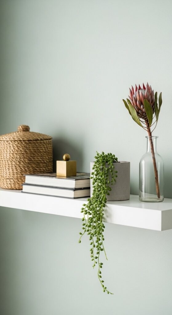
Build Around a Color Palette
The fastest way to make a shelf arrangement look cohesive is to edit by color before you edit by object. Pick two or three tones and stick to them.
Popular shelf palettes that photograph beautifully:
- Warm neutrals — cream, tan, warm white, and natural wood tones
- Earthy and muted — terracotta, sage, dusty rose, and raw linen
- Monochromatic white — all white and off-white with varied textures
- Dark and moody — black, deep green, charcoal, and aged brass
If you have a book with a bright red spine that you love but it breaks the palette — turn it around. Spine-out books in a neutral tone are a widely used shelf-styling trick that works every time and costs nothing.
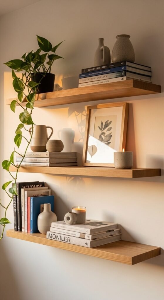
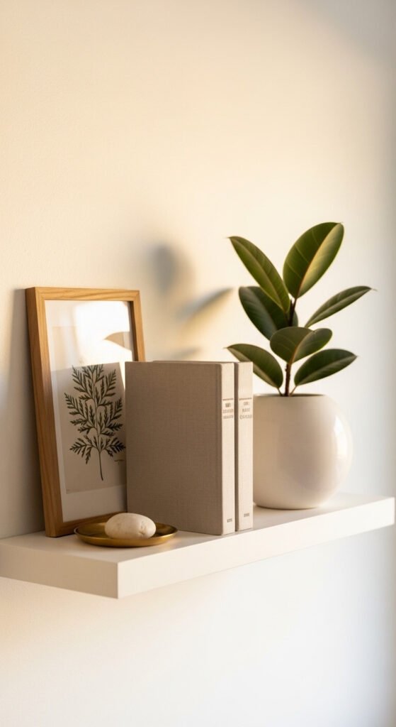
Use the Triangle Rule to Create Visual Flow
This is the styling principle that separates shelves that look random from shelves that look designed. When you place objects of varying heights in a triangular arrangement — one tall item, one medium, one low — your eye naturally travels across the grouping in a satisfying arc.
Here’s how to apply it in practice:
- Tall items: A stack of books used vertically, a vase with a long stem, a small plant on a riser, a framed print leaning against the wall
- Medium items: A candle, a ceramic bowl, a small sculpture, a horizontal stack of two or three books
- Short items: A small succulent, a single stone, a tiny vessel, a folded linen
Group objects in odd numbers — threes and fives almost always look more natural than pairs. And vary the spacing between groups. Clusters of three with intentional negative space between them read better than items lined up at even intervals across the entire shelf.
Layer Depth — Front, Middle, and Back
Flat shelf arrangements look flat in photographs and flat in real life. The shelves that stop you on Instagram have depth — objects sitting at different distances from the wall, creating layers you can visually move through.
A simple way to build depth on every shelf:
- Back layer: Something tall leaning against the wall — a framed print, a large book stood upright, a tall vase
- Middle layer: Your main objects — ceramics, candles, plants, smaller books stacked horizontally
- Front layer: Something small that slightly overhangs the shelf edge — a trailing vine, a small dish, a tiny sculptural object
Overlapping objects slightly also adds depth. A small plant partially in front of a book stack looks styled. Everything lined up in a single row looks like a store display shelf.
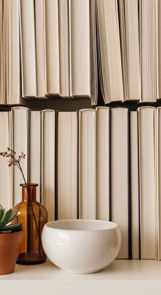
Mix Materials and Textures Intentionally
Visual interest on a shelf doesn’t come from more objects — it comes from more contrast between surfaces and materials. A shelf full of only ceramics looks one-dimensional. A shelf that mixes matte against glossy, rough against smooth, organic against geometric — that’s where things get interesting.
Great material combinations for shelf styling:
- Raw wood (book covers, small cutting board, driftwood piece) + smooth ceramic + trailing greenery
- Woven texture (small basket, rattan object) + glass or crystal + matte linen book spines
- Concrete or stone + dried botanicals + warm brass or gold metal
Plants deserve a special mention. A single trailing pothos or a small fiddle leaf branch in a simple vessel adds life that no object can replicate — and it draws the eye in a way that even the most beautiful ceramic can’t. One plant per shelf is usually enough.
Step Back, Squint, and Adjust
Once everything is placed, step back to the opposite side of the room and look at the full shelf arrangement from a distance. Squinting helps — it blurs the details and lets you see the overall shape and balance of the display.
Ask yourself:
- Does one area look too heavy or too empty compared to the rest?
- Is there a color that jumps out and pulls focus away from everything else?
- Are the heights varied enough or does everything land at the same level?
Make small adjustments — move one tall item to a different cluster, swap a bright object for a neutral one, add a plant where things feel too rigid. It rarely takes more than five minutes of tweaking to take a shelf from “fine” to “finished.”
Your Shelves Are Closer Than You Think
Every shelf you’ve ever admired online was styled using the same handful of principles — a restrained palette, varied heights, layered depth, mixed textures, and enough breathing room to let each object matter. None of it requires expensive objects or a designer eye. It requires intention and a willingness to edit.
Clear them off. Pick your palette. Build in triangles. Layer front to back. Add one plant. Step back and adjust.
Save this article before your next shelf reset — and share it with anyone who’s been staring at their shelves wondering why they never look quite right.