
Ever looked at a beautifully styled room or outfit and wondered, “How did they pull that off?” Mixing patterns is one of those design skills that looks effortless — but feels terrifying to try. The good news? There are simple rules designers swear by, and once you know them, you’ll never look at a striped pillow the same way again.
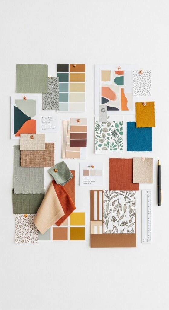
Start With a Color Story
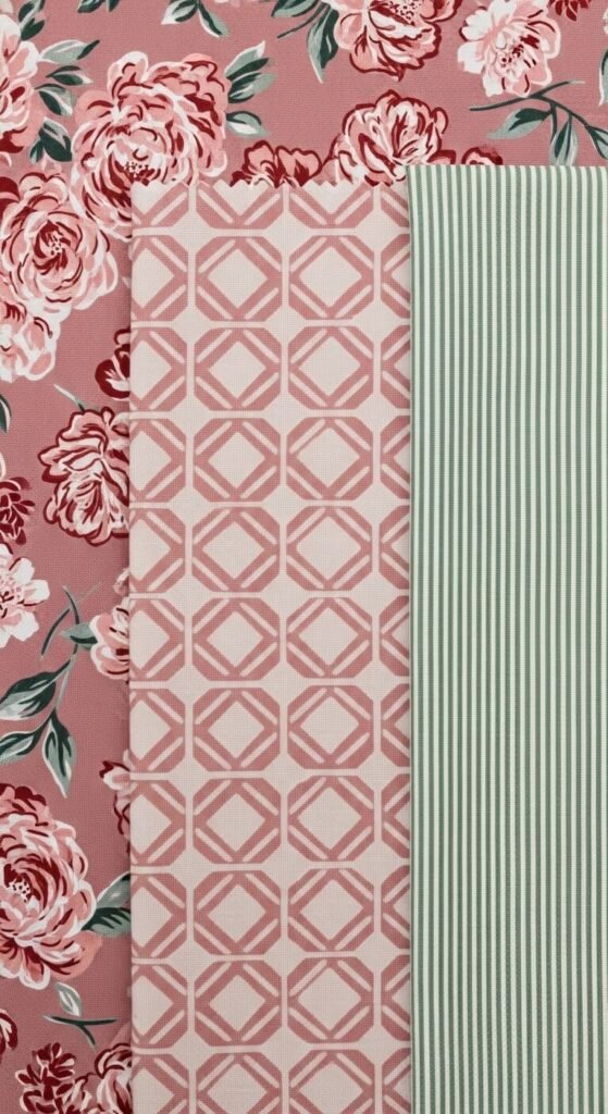
Before you touch a single pattern, pick your color palette. This is the secret weapon every designer uses.
- Choose 2–3 anchor colors that will appear across all your patterns.
- Let one color dominate, one support, and one act as an accent.
- When patterns share the same color family, they naturally harmonize — even if the prints are wildly different.
Think of it like a playlist. Different songs, same vibe.
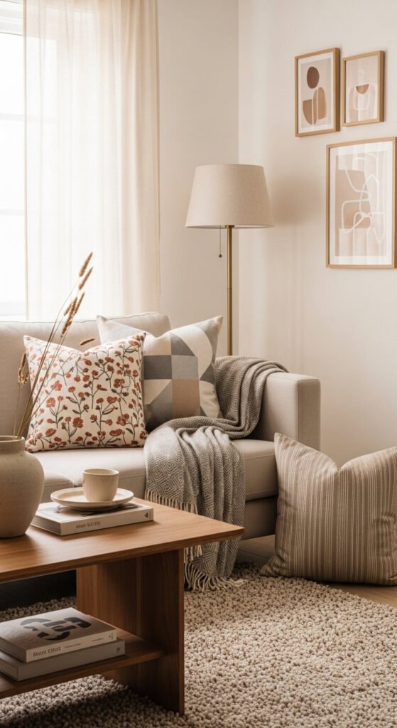
Vary Your Pattern Scale
This is the golden rule of pattern mixing: never pair two patterns of the same size.
- Combine a large-scale print (like a bold floral or oversized plaid) with a small-scale print (like a delicate ditsy print or fine stripe).
- Add a medium-scale pattern as the bridge between the two.
- The contrast in scale creates visual interest without confusion.
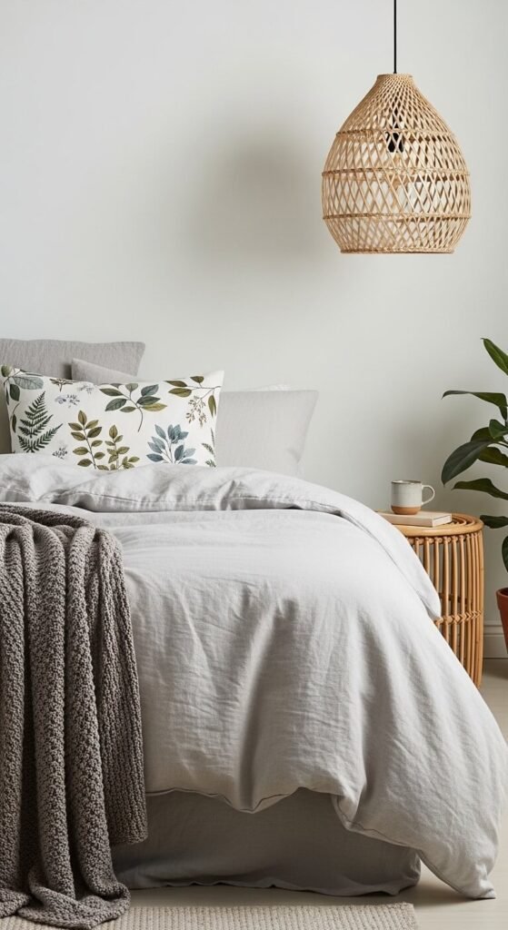
Use the Classic “Three Pattern Formula”
Designers often work in threes. It’s balanced, intentional, and just complex enough to feel curated.
Here’s a foolproof combo to try:
- A solid or near-solid – gives the eye a place to rest
- A geometric or stripe – adds structure and direction
- An organic or floral print – brings softness and personality
Mix these three, keep the colors consistent, and you’ve basically cracked the code.
Don’t Forget Texture as a “Pattern”
Pattern mixing isn’t just about print — texture plays the same visual role.
- A chunky knit, a velvet cushion, or a woven basket can act as a “pattern” without any visible print.
- Layering textures alongside printed patterns adds depth and keeps things from feeling flat or overwhelming.
- When in doubt, swap one printed pattern for a rich texture instead.
The 60-30-10 Rule for Patterns
You’ve probably heard of this rule for color — it works just as well for patterns.
- 60% of your space or outfit uses the dominant pattern (or solid base)
- 30% features a secondary pattern
- 10% is reserved for a bold accent pattern
This ratio keeps things balanced. The eye has a clear focal point, and nothing fights for attention.
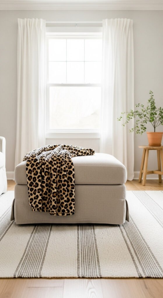
Patterns to Pair With Confidence
Not sure where to start? These combos are practically designer-approved:
- Stripes + Florals – a timeless pairing that works in any color palette
- Plaid + Solid with texture – classic and cozy, especially in fall/winter styling
- Geometric + Abstract – bold and modern, perfect for contemporary spaces
- Animal Print + Neutral Stripe – unexpected but chic when kept in the same tones
Know When to Stop
More isn’t always better. Even designers know when to put the pattern down.
- Once you have three patterns working together, pause and evaluate.
- Step back (literally) and squint at the overall look — if your eye bounces smoothly around the space, you’re golden.
- If something feels “loud,” remove the most similar-scale pattern first.
The Takeaway
Mixing patterns isn’t about breaking rules — it’s about understanding them well enough to bend them with confidence. Start with color, vary your scale, lean on the rule of three, and trust your eye.
You’ve got this. 🎨
Save this article for your next decorating or styling project — and tag us when you nail that pattern mix!