
Neutral doesn’t have to mean empty. But somewhere along the way, “beige” became a punchline — a shorthand for safe, forgettable, and flat. The truth is, some of the most beautiful, magazine-worthy homes are built entirely on a palette of whites, creams, taupes, and warm grays. The difference between a stunning neutral room and a dull one isn’t the color. It’s everything else.
Here’s how to get it right.
Start With a Warm Neutral Base, Not a Cold One
The fastest way to make a neutral room feel lifeless is to lean too far into cool grays and stark whites. Rooms that feel cold and clinical usually have a blue or green undertone lurking underneath.
Instead, anchor your space in warm neutrals:
- Creamy whites (think linen, not copy paper)
- Soft taupes and warm greiges
- Sandy beiges and camel tones
- Terracotta and muted clay accents
These tones pick up natural light beautifully and make a room feel lived-in and welcoming rather than sterile. When in doubt, always test paint swatches in natural daylight before committing — the same paint chip can look completely different at noon versus in the evening.
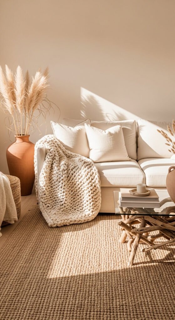
Layer Textures Like Your Life Depends On It
This is the single most important rule of neutral decorating. When you remove color contrast from the equation, texture becomes your contrast.
A room with a linen sofa, a wool throw, a jute rug, a rattan side table, and a chunky knit pillow reads as rich and layered — even if every single item is the same shade of oatmeal. Your eye picks up on the differences in how each material catches and holds light.
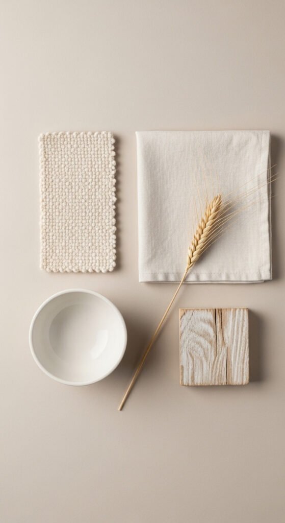
Mix textures freely:
- Smooth: polished stone, glass, glazed ceramics
- Rough: raw wood, woven baskets, linen
- Soft: bouclé, velvet, cotton knit
- Natural: dried botanicals, terracotta, jute
Don’t be afraid to repeat the same color in five different materials. That repetition with variation is exactly what makes neutral rooms look intentional.
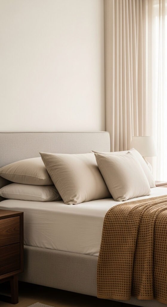
Add Depth With Tonal Variation
Neutral doesn’t mean one note. A room that uses only a single shade of beige from floor to ceiling will feel flat. The trick is to play within the same color family while varying the depth.
Think of it like a tonal stack:
- Light and airy tones on walls and large furniture
- Medium tones on rugs and window treatments
- Deeper, richer neutrals as accents in pillows, throws, or small furniture pieces
This creates a natural visual hierarchy that guides the eye around the room without relying on bold color pops. Even a small shift — from a cream sofa to a caramel leather chair — adds exactly the kind of contrast that keeps a neutral palette feeling dynamic.
Bring In Natural Materials for Visual Interest
Nature rarely uses bold color, and natural spaces never feel boring. Take the cue.
Raw and organic materials add warmth and personality to a neutral room in a way that synthetic items rarely can:
- Wood in varying tones — light oak, walnut, driftwood
- Stone surfaces like marble, travertine, or concrete
- Plants — green is technically a neutral in the right context
- Woven goods like seagrass, cane, and rattan
A terracotta pot with a leafy plant, a marble tray on a coffee table, or a raw-edge wooden shelf — each of these adds a story to the room without introducing a jarring color.
Use Pattern Sparingly — But Do Use It
Pattern isn’t off-limits in a neutral palette. The key is keeping it tone-on-tone.
A cream and white striped pillow, a subtle grid linen curtain, a faint geometric rug in ivory and sand — these add visual rhythm without breaking the palette. One or two patterned pieces per room is usually enough to prevent the space from reading as plain.
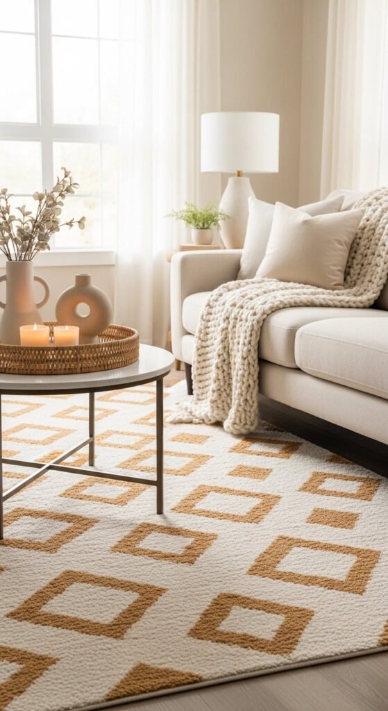
Stick to organic patterns — abstract, botanical, or geometric — rather than bold graphic prints. They add movement without pulling focus.
Let Metallics Do the Heavy Lifting
When you’re not using color to create sparkle and interest, metallics step in beautifully.
Warm metals — brushed brass, aged gold, burnished bronze — add a layer of richness that neutral rooms need. Even small doses work: a brass lamp base, a gold-framed mirror, bronze cabinet hardware. These elements catch light and create micro-moments of visual interest throughout the day as the light shifts.
Cool metals like chrome and polished nickel tend to push neutrals colder. If your palette skews warm, keep your metals warm too.
The Bottom Line
Neutral decorating isn’t about playing it safe. It’s about playing it smart.
When you get the foundation right — warm tones, layered textures, tonal variation, natural materials, and just enough pattern and metal — a neutral room becomes something genuinely beautiful. It feels calm without being cold. Considered without being stiff. And endlessly livable.
Save this article for your next room refresh — and the next time someone calls your palette “boring,” show them what neutral can actually look like.