
Gray gets a bad reputation it doesn’t deserve. For years it was the default choice of the uninspired — the safe, corporate, nothing-to-say wall color of a thousand rental apartments. But here’s the truth that experienced decorators have known all along: gray, used well, is one of the most sophisticated, flexible, and quietly powerful neutral bases available. It doesn’t compete. It doesn’t shout. It simply creates the most effortless backdrop imaginable — one that makes every color you layer on top of it look more intentional, more rich, and more considered. The secret isn’t whether to use gray. It’s knowing which gray, and how.
This guide walks you through everything you need to know to use gray as your neutral foundation — and build a home on top of it that feels anything but bland.
Understanding Gray’s Secret: Undertones Are Everything
If you’ve ever painted a wall gray and been horrified when it dried lavender, or green, or the color of a storm cloud on a bad day — you’ve been ambushed by undertones. And understanding them is the single most important thing you can know about decorating with gray.
Every gray paint has a secondary hue buried beneath the surface. That underlying color is the undertone, and it only reveals itself fully once the paint dries and interacts with your room’s specific light, flooring, and furnishings.
The most common gray undertones:
- Blue undertones — the most common; can read anywhere from crisp and cool to slightly purple in certain lights; pairs beautifully with white, navy, and silver
- Green undertones — subtle in some grays, more pronounced in others; pairs well with wood tones and natural materials but can clash with warm terra cotta and pink
- Purple or violet undertones — appears in many mid-tone grays and can surprise decorators who weren’t expecting it; pairs well with cooler palettes and jewel tones
- Warm or brown undertones — the most forgiving undertone family; these greige-adjacent grays work with virtually everything and are the most versatile choice for whole-home decorating
How to identify your gray’s undertone before committing:
- Paint a large swatch — at least 12 by 12 inches — on the actual wall you’re considering
- Observe it at multiple times of day: morning light, midday, and evening lamplight will all read differently
- Hold swatches of your existing furniture and flooring against it to check for conflict or harmony
Taking this step before purchasing a full gallon saves enormous time, money, and the particular heartbreak of a color that seemed perfect in the store.
Choosing the Right Gray for Your Space
Not all gray applications are created equal. The right shade of gray depends heavily on what role you’re asking it to play — and in which room.
Light grays (barely-there, almost white with a gray whisper):
- Make small rooms feel larger and airier
- Work beautifully in bedrooms, bathrooms, and any space that benefits from a feeling of quiet openness
- Pair best with warm wood tones, soft whites, and blush or sage accents
- Best picks to explore: classic light grays with warm undertones, or cool barely-gray shades that sit just off pure white
Mid-tone grays (the classic, versatile gray family):
- The most universally workable shade; reads as definitively gray without feeling dark or heavy
- Works in living rooms, dining rooms, hallways, and open-plan spaces
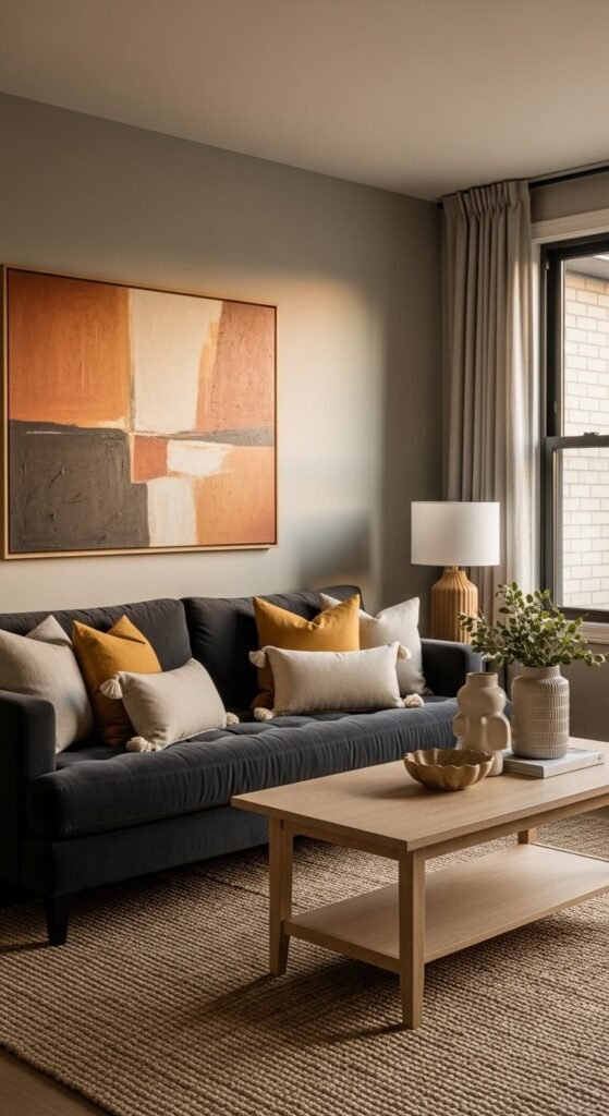
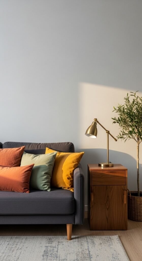
- Pairs well with almost every accent color — from warm mustard and terracotta to cool navy and emerald
- The best foundation for a rotating accent color strategy (more on that below)
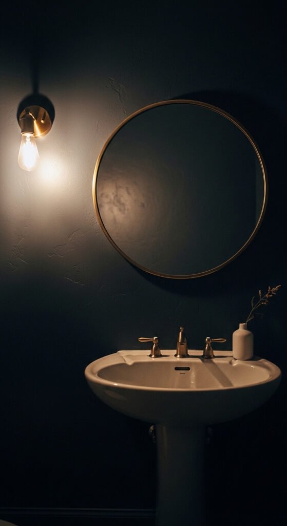
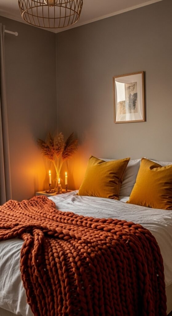
Dark grays and charcoals (dramatic, moody, deeply sophisticated):
- Best used on a single feature wall or in smaller rooms where depth is desirable — a powder room, a study, a bedroom
- Creates an enveloping, intimate quality that makes a space feel cocooned and considered
- Pairs strikingly with warm brass, creamy white, and rich jewel tones
- Works as a cabinet color in kitchens and bathrooms for a sleek, editorial look
The Best Colors to Layer Over Gray
This is where gray earns its versatility crown. Because it neither competes nor overwhelms, gray accepts accent colors with remarkable generosity — which makes it the ideal base for a home you want to refresh seasonally or evolve over time without repainting.
Accent colors that shine against gray:
- Mustard and warm yellow — brings immediate warmth and sunshine to a cool gray base; one of the most timeless gray combinations
- Deep navy — cool on cool creates a sophisticated, monochromatic depth that feels very tailored and considered
- Terracotta and rust — warm earth tones against cool gray is a combination that feels both contemporary and timeless
- Emerald and forest green — one of the most popular gray pairings of recent years; the richness of deep green against gray feels lush and elevated
- Blush and dusty rose — softens a gray room beautifully; the combination feels feminine without being sweet
- Black and white — a graphic, high-contrast approach that turns a gray room into something almost architectural
- Natural wood tones — arguably the most important pairing of all; warm wood floors, furniture, and accessories are what prevent a gray room from reading as cold or clinical
Making Gray Feel Warm, Not Cold
The single biggest concern people have about decorating with gray is that it will make their space feel cold, clinical, or hospital-like. This is a real risk — but it’s an entirely preventable one.
The warmth formula for gray rooms:
- Always include warm wood tones — floors, furniture legs, frames, or decorative objects; wood is the antidote to gray’s coolness
- Choose warm-white or cream for trim and ceilings — a stark bright white trim can make gray walls feel harsher; an off-white or warm cream softens the contrast beautifully
- Layer multiple textures — linen, boucle, wool, rattan, and jute all read as warm even in neutral tones; texture adds visual warmth that color alone can’t always provide
- Use warm-toned lighting — bulbs with a color temperature of 2700K to 3000K cast a golden light that transforms any gray room from cool to inviting
- Add plants liberally — the green of living plants is one of the warmest, most organic additions to any gray space
Follow this formula and gray will never read as cold in your home again.
Refreshing a Gray Room Seasonally Without Repainting
One of the greatest gifts of gray as a neutral base is how effortlessly it accommodates seasonal changes through accessories alone — no repainting, no new furniture, just a thoughtful swap of textiles and accents.
- Spring: Swap in blush, sage, and soft yellow cushions; bring in fresh flowers and light linen throws
- Summer: Lean into crisp white accents, natural rattan pieces, and pops of bright coral or sky blue
- Autumn: Layer in deep rust, warm mustard, and forest green; add chunky knit throws and dried botanical arrangements
- Winter: Go rich and moody with navy, burgundy, and cream; add velvet cushions, candlelight, and deep green garlands
The gray stays. Everything around it gets to evolve.
Gray Is Not the Absence of a Decision — It’s the Best One
The homes that use gray most beautifully aren’t the ones that chose it because they couldn’t decide on something else. They chose it because they understood what a great neutral does: it gets out of the way and lets everything else shine. With the right undertone, the right shade for the space, the right accent colors layered on top, and the right warmth woven through every material choice — a gray room is one of the most satisfying, most livable, and most endlessly refreshable spaces you can create.
Save this guide for your next decorating decision, share it with someone who’s been afraid of gray for all the wrong reasons, and go find the shade that makes your whole room make sense. 🩶✨