
Gold has a reputation problem. Used well, it’s the finish that makes a room look expensive, warm, and intentionally designed. Used poorly, it looks like a Vegas hotel lobby circa 2003. The difference between the two comes down to restraint, placement, and choosing the right kind of gold in the first place. The good news is that you don’t need to gut your home or spend a fortune to get it right. A few carefully placed gold accents — in the right spots, paired with the right colors — can completely transform a space. Here’s exactly how to do it.
Choose the Right Kind of Gold First
Not all gold is created equal — and this is where most decorating mistakes begin. Bright, shiny, yellow gold reads as cheap and garish in most home settings. The gold that actually looks elegant is almost always one of these:
- Brushed brass — muted, warm, and matte. The most popular right now and the easiest to work with
- Antique gold — slightly darker, with an aged quality that feels collected and timeless
- Satin gold — a soft sheen without a mirror finish. Works in both modern and traditional spaces
- Warm champagne — very light gold, almost neutral. Pairs beautifully with white and cream
Avoid polished yellow gold and anything with a reflective chrome-like finish unless you’re deliberately going for a maximalist, high-glam look. Matte and brushed finishes are more forgiving, more current, and easier to blend with other materials.
Use Gold in Small, High-Impact Spots
The secret to gold that elevates instead of overwhelms is placement. You want gold where the eye naturally travels — not everywhere.
The highest-impact spots for gold accents:
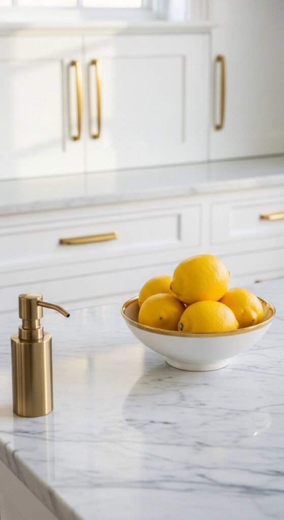
- Hardware — cabinet pulls, drawer knobs, door handles, and faucets. Small surface area, enormous visual effect
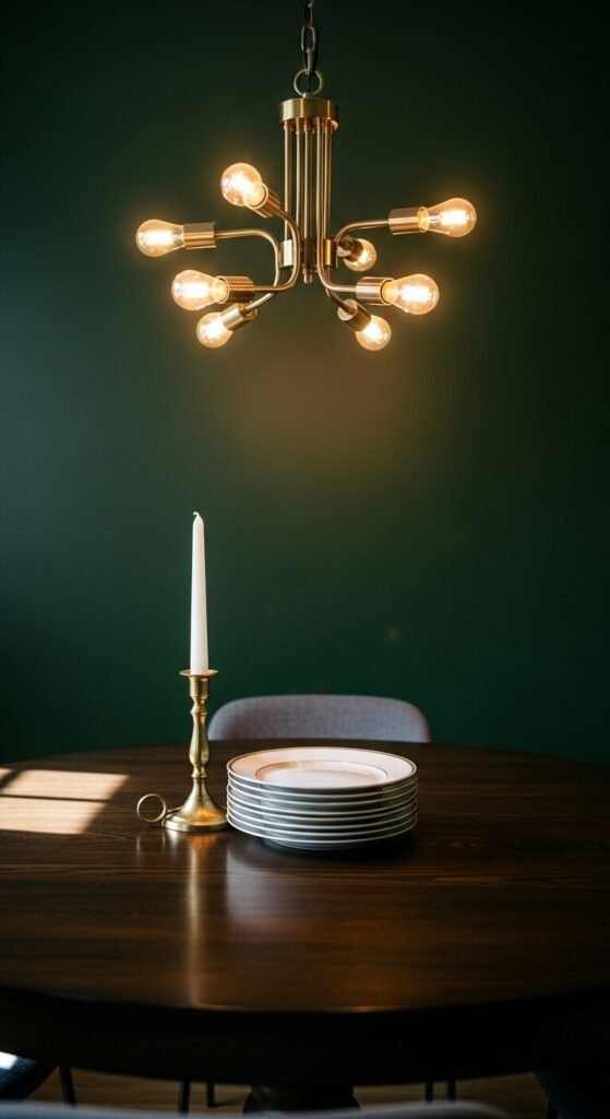
- Lighting — a single brass pendant or gold table lamp base does more for a room than ten smaller accessories
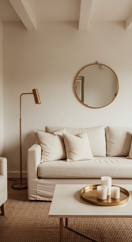
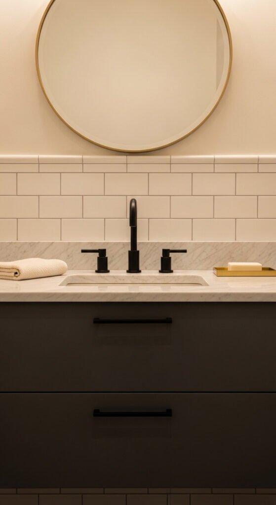
- Mirror frames — a gold-framed mirror reflects both light and the gold finish back into the room
- Tray and bowl styling — a brass tray on a coffee table or kitchen island grounds a vignette with warmth
- Picture frames — swap out black or silver frames for gold throughout one room for instant cohesion
The rule of thumb: three to five gold touches per room is enough. More than that and gold stops feeling like an accent and starts feeling like a theme.
Pair Gold With the Colors That Make It Glow
Gold is chameleon-like — it shifts depending on what surrounds it. Some pairings make it look rich and warm. Others make it look harsh or dated.
Colors that bring out the best in gold:
- Deep navy or forest green — classic and dramatic. Gold pops brilliantly against dark, saturated walls
- Soft white and cream — clean and elegant. The most versatile backdrop for any gold finish
- Warm terracotta and rust — earthy and rich. Creates a warm, sun-drenched feel
- Blush and dusty rose — romantic and soft. Gold adds just enough edge to keep it from going too sweet
- Charcoal and warm gray — sophisticated and modern without feeling cold
Avoid pairing gold with:
- Cool-toned grays or icy blues — the contrast feels off and flattens both elements
- Silver or chrome finishes in the same room — mixing metals works, but gold and silver together need careful handling to avoid looking accidental
Layer Gold With Organic and Natural Materials
One of the fastest ways to make gold look overdone is to surround it with other shiny or synthetic materials. Gold looks most expensive and most intentional when it’s grounded by natural textures.
Pair your gold accents with:
- Raw wood — light oak, walnut, or driftwood tones balance the warmth of brass beautifully
- Linen and cotton — soft, matte fabrics absorb light where gold reflects it, creating visual balance
- Stone and marble — white marble with gold veining and brass fixtures is a pairing that never ages
- Woven textures — rattan, jute, and seagrass pull gold back from feeling formal or precious
- Terracotta and ceramics — earthy and matte, they ground gold in a way that feels collected, not decorated
Think of gold as the jewelry in the room. The clothing underneath — your walls, rugs, upholstery, and wood — should be relatively understated so the gold has room to shine.
Mix Gold With Other Metals — Carefully
One of the biggest design shifts of the last decade is the move away from matching metals throughout a home. Mixing metals now reads as sophisticated and intentional — as long as you follow one simple rule.
Pick one dominant metal and one supporting metal.
Gold works beautifully with:
- Matte black — high contrast, modern, and graphic. Use black as the dominant finish and gold as the accent, not the other way around
- Aged bronze or copper — warm and tonal. They sit in the same color family as gold and blend naturally
- Brushed nickel — a cooler neutral that can work with gold if it leans warm
Keep the ratio roughly 70/30 — one metal in most of the room, the second appearing in a few supporting spots. When metals are split evenly, the room starts to feel scattered.
The Golden Rule of Gold Decorating
Here it is, simplified: less, warmer, and grounded.
Less gold than you think you need. Warmer finishes than you assume look good. Grounded by natural materials that let the metal breathe.
Gold isn’t a statement on its own — it’s a supporting character that makes everything around it look more considered and more beautiful. Use it that way, and your home will have the kind of quiet elegance that people notice without being able to explain exactly why.
Save this article for your next room refresh — and share it with anyone who’s been afraid to try gold because they weren’t sure where to start.