
There’s a reason you feel instantly at ease staring at the ocean, gazing at a clear sky, or stepping into a room wrapped in soft, watery blue. Blue is the most universally calming color on the spectrum — it slows the heart rate, quiets the mind, and makes any space feel like a breath of fresh air. Whether you’re drawn to the deep confidence of navy, the cool sophistication of slate, or the airy softness of sky blue, every shade has a place in a beautifully designed home. The trick is knowing which blues work where — and how to layer them so a room feels serene rather than cold.
This guide walks you through everything you need to know to decorate confidently with blue — from the boldest navy to the softest powder, in every room of your home.
Understanding the Blue Spectrum
Not all blues feel the same in a space, and understanding the difference before you commit to a shade is everything. Blue is one of the trickiest colors to choose because it shifts dramatically depending on light, undertones, and what surrounds it.
Here’s a quick breakdown of the main blue families and the moods they create:
- Navy and midnight blue — deep, grounding, and sophisticated; adds drama and anchors a room with confidence; works especially well as an accent wall or on cabinetry
- Cobalt and royal blue — bold, vibrant, and energizing; best used in doses as accents rather than overall wall color
- Slate and steel blue — cool, modern, and understated; pairs beautifully with grey and white for a clean, contemporary feel
- Dusty and muted blue — soft, nostalgic, and quietly beautiful; a favorite in cottagecore and Scandinavian-inspired spaces
- Powder and sky blue — the most soothing and airy of the family; makes rooms feel larger and lighter, perfect for smaller spaces
- French and periwinkle blue — sits between blue and violet for a romantic, timeless quality that works in bedrooms especially well
The rule of thumb: lighter blues open a space up and calm it; deeper blues add intimacy and drama. Neither is wrong — it just depends on the effect you’re after.
The Best Rooms for Each Shade of Blue
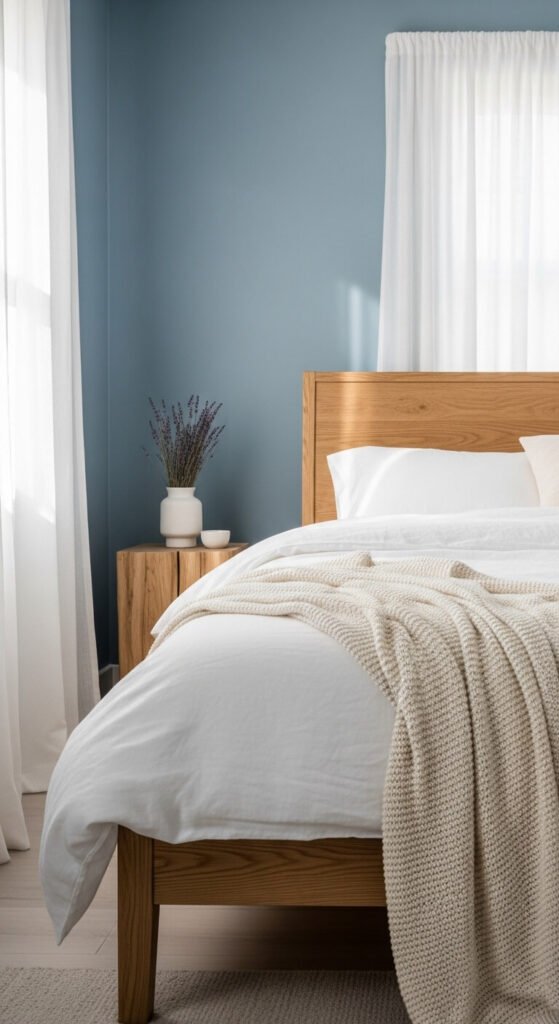
Bedroom: Go Soft and Soothing
The bedroom is where blue truly thrives. Cool, muted shades of blue have been shown to promote restful sleep and lower anxiety — making them the ideal choice for the one room in your home where calm is the whole point.
- Dusty blue, powder blue, or French blue on the walls for a serene, sleep-friendly atmosphere
- Navy as an accent — a deep blue headboard or velvet throw against soft white bedding creates a beautiful, grounded contrast
- Periwinkle or lavender-blue for a romantic, dreamy quality that feels timeless
Keep the rest of the palette soft: white, warm cream, natural linen, and wood tones. Let the blue do the emotional work without overcrowding it.
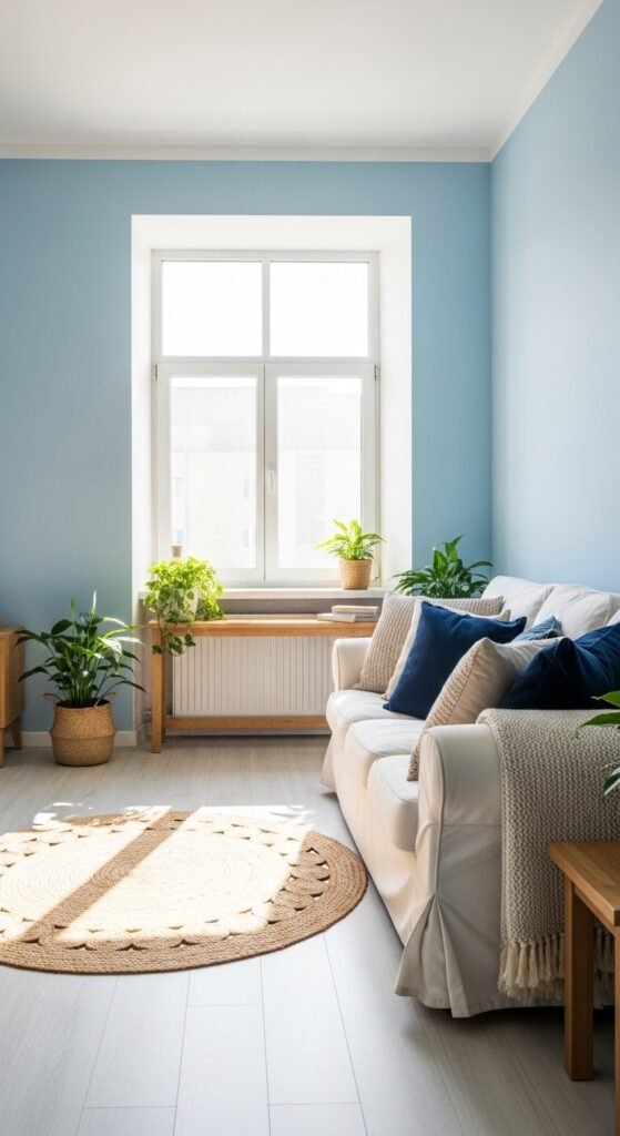
Living Room: Layer Your Blues
The living room is where you have the most freedom to play with blue because there are so many surfaces to work with — walls, furniture, textiles, and accents all become opportunities.
- A navy or deep blue accent wall behind the sofa grounds the seating area and creates a stunning focal point
- Sky blue or slate as the main wall color makes a living room feel relaxed and endlessly livable
- Blue through accessories only — pillows, throws, a rug, or a statement vase — for the most flexible, commitment-free approach
The key to a living room that uses blue beautifully without feeling cold is warmth in everything else. Warm wood tones, brass hardware, cream upholstery, and natural textures like rattan and linen all balance blue’s coolness with organic comfort.
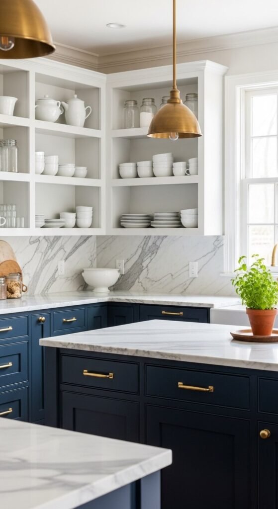
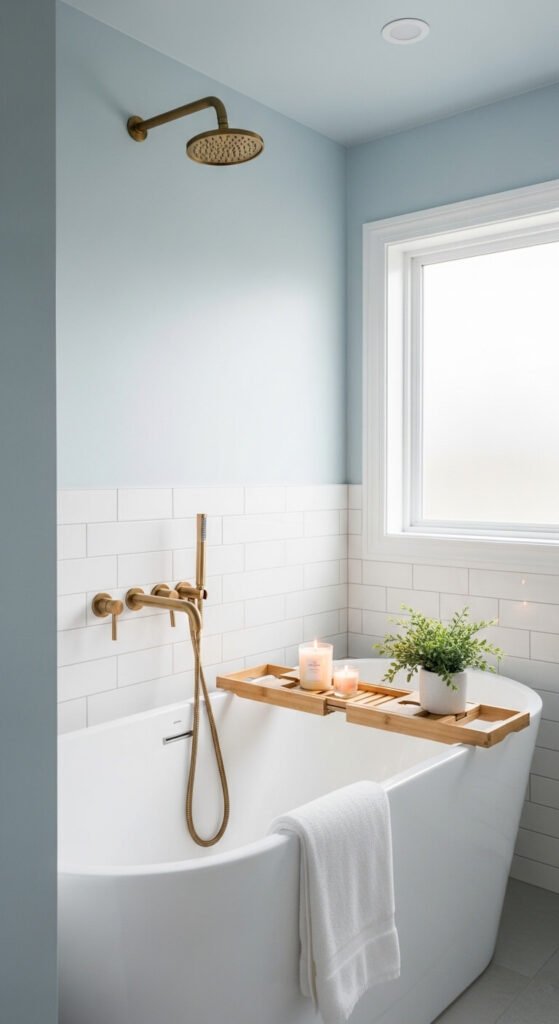
Kitchen and Bathroom: Bold Moments Welcome
These rooms have smaller surface areas and more architectural detail, which makes them the perfect place to go bolder with blue.
- Navy lower cabinets paired with white uppers and brass hardware is a kitchen combination that never goes out of style
- A powder blue ceiling in a bathroom creates a sky-like effect that feels unexpectedly serene
- Cobalt blue tile as a backsplash or shower surround introduces a vivid, energizing pop of color that photographs beautifully
Colors That Pair Perfectly With Blue
Blue is one of the most versatile colors in the palette — it genuinely plays well with almost everything. But some combinations are truly exceptional.
Blue’s best color partners:
- White and cream — the most classic pairing; clean, fresh, and always timeless
- Warm wood tones — natural oak, walnut, and rattan bring warmth that balances blue’s cool quality beautifully
- Brass and gold — metallic warmth against cool blue is one of the most sophisticated combinations in interior design
- Terracotta and rust — unexpected but stunning; the contrast of warm earth tones against cool blue feels both grounded and artful
- Soft sage green — a nature-inspired pairing that feels calm, fresh, and quietly beautiful
- White and navy together — the nautical combination that works in every context from coastal to modern classic
Tips for Decorating With Blue Confidently
A few practical principles to keep in mind as you bring more blue into your home:
- Test paint in large swatches first. Blue shifts more dramatically in different light than almost any other color. What looks perfect on a chip can look entirely different on a north-facing wall.
- Mix your blues intentionally. Different shades of blue can absolutely coexist — a navy sofa with sky blue walls and a slate rug feels layered and sophisticated. But vary the tones rather than using the exact same shade everywhere.
- Don’t forget the fifth wall — the ceiling. A pale blue ceiling is one of the most beautiful and underused design moves. It references the sky and makes any room feel more expansive.
- Ground bold blue with natural materials. The more saturated your blue, the more important it is to bring in wood, linen, rattan, or stone to prevent the room from feeling stark.
- Start with accessories if you’re nervous. A blue ceramic vase, a cobalt throw pillow, or a navy side table lets you feel out the color in your space before committing to walls or furniture.
Let Blue Work Its Calming Magic
Of all the colors you can bring into a home, few are as forgiving, as flexible, or as genuinely mood-lifting as blue. It connects us to sky and water, to open horizons and quiet mornings — and it carries all of that feeling right into your living room, bedroom, or kitchen. Whether you dive into dramatic navy or whisper in with the softest powder blue, there’s a shade that belongs in your home.
Save this guide for your next room refresh, share it with someone who’s been afraid to try blue, and go find your perfect shade — your calmest, most beautiful space is waiting. 💙✨