
We’ve all been there. You fall in love with a paint color in the store, spend a weekend rolling it onto your walls, step back to admire your work and… immediately hate it. The color that looked perfect on that tiny chip now feels completely wrong in your space.
Choosing paint colors is one of the most stressful parts of decorating. One wrong move and you’re either living with a color you can’t stand or spending another weekend (and another paycheck) fixing your mistake.
But here’s the good news: there’s a foolproof method for choosing paint colors you’ll genuinely love for years to come. No more second-guessing, no more buyer’s remorse, and definitely no more painting the same room three times. Let’s dive into the strategy that actually works.
Start With Your Existing Elements (Not Pinterest)
Here’s where most people go wrong: they choose a paint color first, then try to make everything else work around it. Flip that process completely.
Your paint should complement what you already have:
- Flooring (wood tones, tile, carpet)
- Fixed elements (countertops, cabinets, fireplace)
- Large furniture pieces you’re keeping
- Artwork or textiles you love
Pull colors from these existing pieces rather than fighting against them. If you have warm honey-toned hardwood floors, cool gray walls will always feel off. If your sofa is covered in warm beige fabric, icy blue walls will create a clash.
Take photos of your room and examine what undertones are already present. This is your color family starting point.
Understand Undertones (This Changes Everything)
Every paint color has an undertone, and this is the secret that separates people who nail their paint choices from those who don’t.
What are undertones? They’re the subtle hints of color hiding beneath the main color. A “gray” can have blue, green, purple, or even pink undertones. A “white” might lean yellow, gray, blue, or pink.
Here’s how to spot them:
- Compare your paint sample to pure white paper
- Look at it next to other colors to see what emerges
- Check it in different lighting throughout the day
- Ask: does this feel warm (yellow/red base) or cool (blue/green base)?
Matching undertones to your existing elements is the key to making everything feel cohesive. Warm undertones with warm undertones. Cool with cool. It’s that simple—and that important.

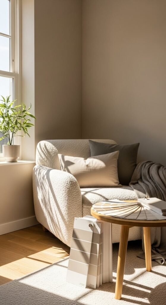
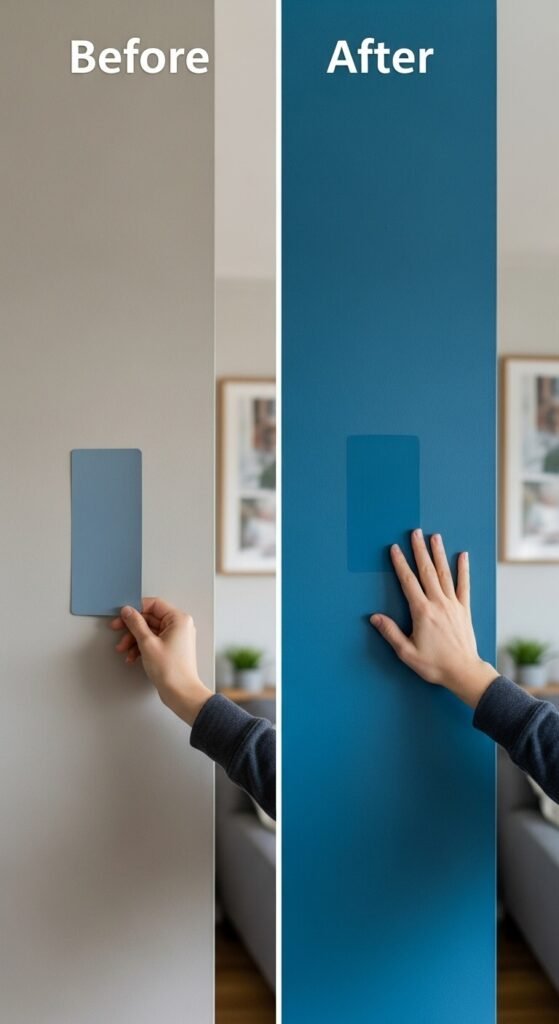
Test Paint In Your Actual Space (The Right Way)
Never, ever choose a paint color based solely on a tiny chip at the store. Those little squares lie. Here’s how to test properly:
Get large samples
- Buy peel-and-stick sample sheets or sample pots
- Paint poster boards (2×2 feet minimum) in your color
- Apply TWO coats (one coat never shows the true color)
Move them around the room
- Test on different walls (light hits each wall differently)
- Move samples throughout the day
- Check in morning light, afternoon sun, and evening lamp light
- Notice how the color changes—this is normal and expected
Live with it for at least 3-4 days
- Quick glances aren’t enough
- You need to see the color in all conditions
- Notice if it’s growing on you or wearing on you
This testing phase is not optional. It’s the difference between loving your choice and having regrets.

Consider Your Lighting Situation
The same paint color looks completely different in a north-facing room versus a south-facing one. Light changes everything.
North-facing rooms:
- Receive cool, blue-toned light
- Colors appear darker and cooler
- Warm paint colors help balance the cool light
- Avoid cool grays (they’ll look dingy)
South-facing rooms:
- Get warm, golden light all day
- Colors appear brighter and warmer
- Can handle cooler paint tones
- Almost any color works well here
East-facing rooms:
- Morning sun, then cooler afternoon light
- Paint will look different throughout the day
- Test extensively at different times
West-facing rooms:
- Warm afternoon and evening light
- Colors will glow in golden hour
- Can create dramatic shifts in color appearance
Understanding your light situation prevents the “why does this look different than I expected?” disappointment.
Choose Based On Mood And Function
Different rooms need different energy levels. The color that’s perfect for your bedroom might be terrible for your home office.
Match color intensity to room purpose:
Active spaces (kitchen, home office, playroom):
- Slightly brighter, more energizing colors
- Crisp whites or colors with clarity
- Can handle bolder choices
Restful spaces (bedroom, bathroom, reading nook):
- Softer, more muted tones
- Warm neutrals or gentle colors
- Avoid overly stimulating shades
Social spaces (living room, dining room):
- Welcoming, comfortable colors
- Mid-tones that work day and evening
- Colors that complement conversation and gathering
Think about how you want to feel in each space, then choose colors that support that mood.

Stick To A Cohesive Color Flow
Your home should feel connected, not like each room was painted by a different person with completely different taste.
Create flow by:
- Using the same color family throughout (all warms or all cools)
- Varying the depth of color rather than switching color families
- Keeping trim and ceiling colors consistent
- Making sure colors visible from room to room work together
Stand in your hallway and look into multiple rooms. Can you see several paint colors at once? They should feel harmonious, not jarring.
You don’t need to paint everything the same color, but your palette should feel intentional and related.
Don’t Fear Going Lighter Than You Think
Here’s a common mistake: people choose a paint color they love on the sample, then are shocked when it looks darker and more intense on all four walls.
Paint amplifies on walls. A color that looks perfect on a small sample will look significantly deeper and more saturated when it’s covering an entire room.
The fix? Choose a color one or two shades lighter than what you think you want. You can always go darker, but it’s expensive and time-consuming to go lighter.
When in doubt, err on the side of softer and lighter. You’ll thank yourself later.
Trust The Process (And Your Gut)
After all the testing, analyzing, and comparing, pay attention to your instinctive reaction.
Ask yourself:
- Do I feel calm and happy when I look at this color?
- Does it make the room feel bigger or cozier (whichever you want)?
- Can I imagine living with this for 5+ years?
- Does it feel like me?
If you’re constantly second-guessing a color, it’s probably not the right one. The right paint color feels like a relief, not a compromise.
Ready to find your perfect paint color? Follow these steps in order, take your time with the testing phase, and trust the process. The right color is out there waiting for you—and when you find it, you’ll know. Save this guide for your next painting project, and say goodbye to paint regret forever! Your walls (and your future self) will thank you.