
A neutral room done well is one of the most livable, most timeless foundations in interior design. Warm whites, soft greiges, gentle creams — they create a sense of calm and openness that few color-heavy spaces can match. But a neutral room without intentional accent color is like a beautifully composed song played at half volume. It’s pleasant. It functions. And it leaves you vaguely feeling like something is missing. The right accent color doesn’t compete with your neutral base — it completes it. It gives the eye somewhere to land, gives the room a personality, and transforms a space that reads as “safe” into one that reads as “considered.” The difference is just a matter of knowing how to choose.
This guide walks you through the exact process of choosing accent colors that work with your specific neutral foundation — and how to layer them in so the room feels curated, not patchy.
Step One: Read Your Neutral’s Undertone First
Before choosing a single accent color, you need to understand the undertone of your neutral — because your accent color will either harmonize with that undertone or fight it. And fighting undertones is the most common reason an accent color that looked right in the store looks wrong on the shelf at home.
How to identify your neutral’s undertone:
- Warm neutrals (creamy whites, warm beige, greige, soft tan) have yellow, orange, or red undertones pulling beneath the surface
- Cool neutrals (crisp white, blue-grey, soft grey, taupe with a purple lean) have blue, green, or purple undertones
- True neutrals (balanced whites and mid-tone greys) sit between warm and cool and are the most forgiving base for accent color choices
The undertone rule for accent colors:
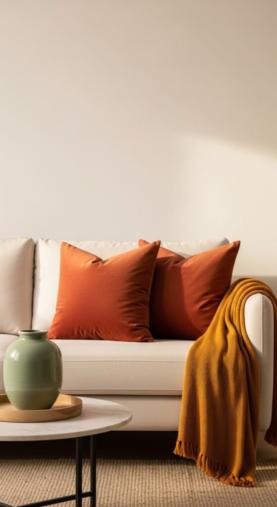
- Warm neutrals pair most naturally with other warm tones — terracotta, mustard, rust, deep warm green, camel, and burnt orange
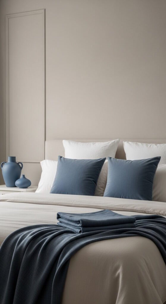
- Cool neutrals pair beautifully with cool accent tones — dusty blue, sage, lavender, teal, charcoal, and crisp navy
- True neutrals are the most flexible and accept both warm and cool accents gracefully — which is why so many designers default to them as a base
The moment you understand your neutral’s undertone, your accent color choices narrow significantly — and the shortlist you’re left with is the one that will actually work in the room.
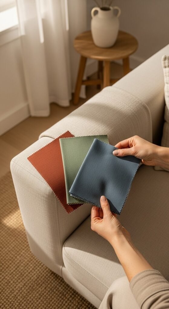
Step Two: Choose One Anchor Accent Color
Resist the temptation to introduce four accent colors at once. A neutral room with a single well-chosen, well-layered accent color looks infinitely more designed than one with multiple competing colors fighting for attention.
How to identify your anchor accent:
- Look at what you’re already drawn to — the color in the artwork you’ve saved, the cushion you keep coming back to online, the color in the rug you love but haven’t bought yet
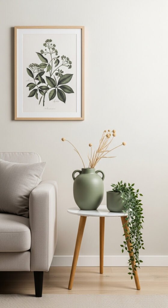
- Consider the feeling you want the room to create — warmth and energy (terracotta, mustard, deep red), calm and fresh (sage, dusty blue, soft teal), drama and depth (forest green, navy, charcoal, aubergine)
- Think about what you already own — if your sofa is cream and your floors are warm oak, a terracotta accent will feel immediately at home; if your floors are cool grey stone, a dusty sage or slate blue will feel more natural
Once you’ve chosen your anchor accent, commit to it — and repeat it at least three times in the room at varying heights and scales. This repetition is what creates a cohesive, intentional look rather than a random splash of color.
Step Three: Add a Supporting Accent in a Lower Dose
Once your anchor accent is established, a second supporting color in a smaller dose adds depth and sophistication without creating visual chaos. Think of it as a harmony note — present enough to enrich, quiet enough not to compete.
The supporting accent formula:
- Choose a color that sits adjacent to your anchor accent on the color wheel — if your anchor is terracotta (warm red-orange), your supporting accent could be warm mustard (yellow-orange) or deep rust (red)
- Alternatively, choose a tonal variation of your anchor — a lighter or darker version of the same hue; dusty sage and deep forest green together, or pale blush and deep burgundy
- Or choose a natural neutral-plus — warm camel, natural wood tones, raw linen, and aged brass all function as supporting accents without reading as full color
Use your supporting accent in the smallest doses: a single object, a candle, a small piece of art, a plant pot. It should be discovered in the room rather than announced.
Where to Place Accent Color for the Best Effect
Knowing which color to use is only half the answer — knowing where to put it determines whether the room looks designed or decorated. Accent colors placed only at one height or in one zone feel unfinished. Repeated at varying heights across the room, they create the visual rhythm that makes a space feel whole.
The three-height rule:
- High — artwork on the wall, a throw draped over the top of an accent chair, cushions at sofa or bed height; these are the accent colors that read from across the room first
- Mid — vases, books, trays, candles, and small decorative objects on tables and shelves; these are the accent colors discovered at closer range
- Low — a rug, a plant pot on the floor, a small side table; these ground the accent color and prevent the room from feeling top-heavy
Accent Colors by Neutral Base: A Quick Cheat Sheet
Still not sure where to start? Here are the pairings that consistently work beautifully.
Warm white or cream base:
- Terracotta and warm rust
- Dusty sage and olive green
- Warm mustard and deep camel
- Blush and burgundy
Warm greige or beige base:
- Burnt orange and deep brown
- Forest green and natural wood
- Teal and brass
- Deep navy and warm tan
Cool grey or taupe base:
- Dusty blue and charcoal
- Lavender and soft white
- Sage green and pale blush
- Deep teal and matte black
True white base:
- Almost anything works — this is the most forgiving neutral for accent color experimentation
- Bold choices like cobalt, emerald, deep red, or burnt orange are especially striking against true white
Test Before You Commit
Before buying cushions, painting an accent wall, or investing in a statement rug, test your accent color in the actual room. Cut a swatch of fabric, hold a paint chip, or place a single object in the accent color on the surface you’re considering — and live with it for a day or two. Observe how the color looks in morning light, afternoon sun, and evening lamp glow.
What looks perfect in a store under fluorescent lighting can read completely differently in your specific room with your specific light — and knowing before buying saves an enormous amount of money and second-guessing.
Your Neutral Room Is Ready for Its Moment
A neutral foundation isn’t the absence of a design vision — it’s the most versatile canvas you can have. With the right accent color, introduced at the right scale, in the right places, and repeated with intention, a neutral room becomes quietly magnetic. It feels complete. It feels personal. And it feels, finally, like it was designed rather than simply furnished.
Save this guide for your next room refresh, share it with someone whose neutral room has been feeling a little too quiet, and go find the accent color that finally brings yours to life. 🎨🏡