
Walk into a home that feels cohesive — where every room feels connected to the one before it, where the colors shift gradually rather than clashing — and it feels like the whole house was designed by one thoughtful person with a clear vision. Walk into a home where every room is a different color with no relationship to the next, and it feels like a series of separate apartments stacked together. The difference is almost entirely a question of color flow — and it is one of the most achievable home design goals available, once you understand the system behind it.
You do not need an interior designer to build a palette that flows. You need a method.
Start with the 60-30-10 Rule
Every well-balanced color palette uses three colors in specific proportions — and this is true whether the home is minimal, maximalist, traditional, or contemporary.
- 60% — your dominant neutral — the color that covers the largest surface area in your home: walls, large furniture, flooring. This should be a calm, versatile tone that you genuinely enjoy living with every day.
- 30% — your secondary color — used in upholstery, curtains, rugs, and larger accent pieces. This can have more personality than the dominant neutral but should still work in multiple rooms.
- 10% — your accent color — used in accessories, cushions, art, and small decorative objects. This is where you bring in your boldest or most personal color choices.
The proportions keep any palette from feeling overwhelming. Even a very bold accent color reads as intentional and contained when it occupies only 10% of the visual space.
Choose an Undertone and Commit to It
This is the step that most people skip — and it is the reason many home color palettes feel slightly off even when the individual colors seem right.
Every paint color, fabric, and flooring material has an undertone — a subtle secondary color beneath the surface tone. Warm undertones lean toward yellow, orange, or red. Cool undertones lean toward blue, green, or purple. Neutral undertones are balanced between both.
The key rule: all undertones in your home should agree.
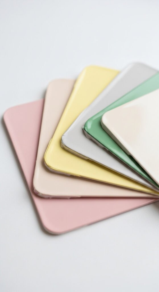
When warm-undertone walls meet cool-undertone furniture in the same room, the colors fight each other. When they share the same warm or cool direction, the room reads as harmonious even if the individual colors are quite different.
- Warm undertone palette: creams, taupes, terracottas, olive greens, and warm blues
- Cool undertone palette: true whites, grey-greens, slate blues, dusty mauves, and cool stone
- Neutral undertone palette: the most flexible — works with both warm and cool accent colors
Test paint colors on the wall in large swatches before committing — and view them at multiple times of day, since natural light dramatically shifts how undertones read.
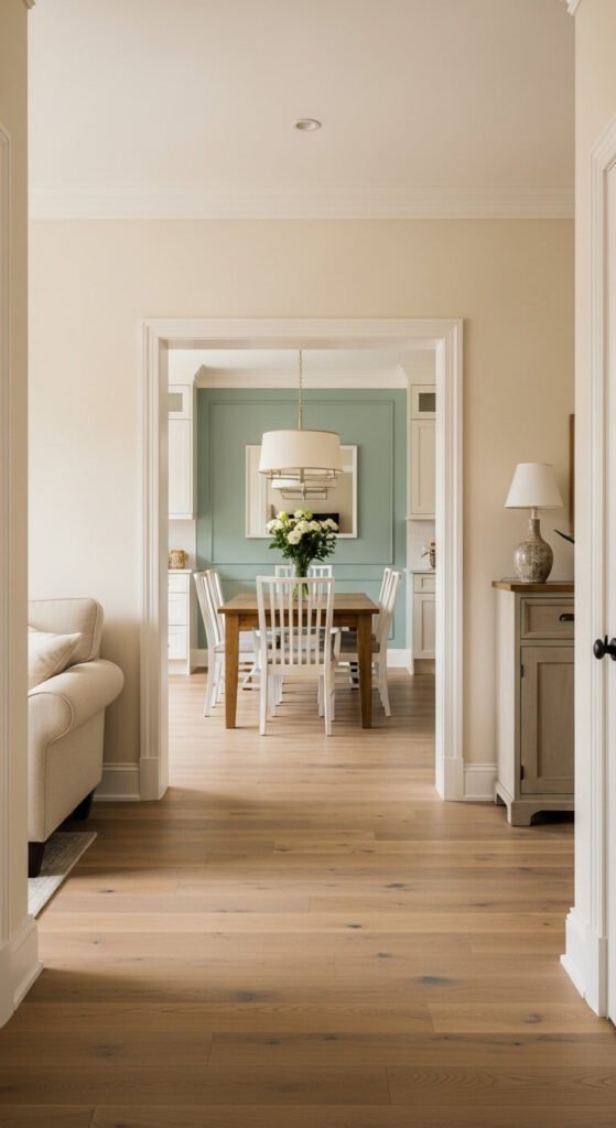
Build a Bridge Color for Open-Plan Spaces
In homes where rooms open directly onto each other — a living room opening to a dining room, a hallway running past multiple doors — the transition between colors is the most visible moment in the whole palette.
The most effective technique is using a bridge color in connecting spaces: a hallway, a staircase, or a shared wall. The bridge color shares undertones with both adjacent rooms and sits tonally between them.
Practical examples:
- Navy living room → warm greige hallway → sage green kitchen
- Terracotta dining room → cream hallway → warm white bedroom
- Charcoal study → medium grey landing → pale blue-grey bedroom
The bridge color does not need to be on every wall. Even a shared rug color, a repeated wood tone, or a consistent flooring material running through both spaces creates enough visual continuity to make the color shift feel intentional.
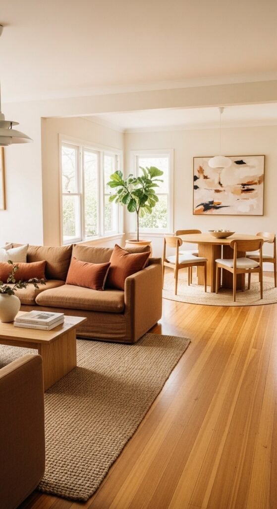
Repeat Each Color at Least Three Times
Once you have chosen your palette, every color should appear in at least three different rooms — not necessarily on the walls, but somewhere visible.
This is what creates the feeling of a cohesive whole rather than isolated room-by-room decisions. When your living room has sage green cushions, your kitchen has a sage green blind, and your bedroom has a sage green throw, the color becomes a thread that runs through the home and ties every space together.
The repeat rule in practice:
- Choose one accent color and place it in every room — in cushions, a vase, a candle, a piece of art
- Use the same wood tone for furniture across multiple rooms
- Use the same or similar white for all trim, architraves, and ceilings throughout the home — a consistent trim color is one of the most powerful cohesion tools available
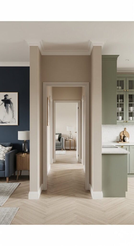
Use Your Flooring as the Constant
The floor is the one surface that most people do not change — and it runs continuously through every room in the home. Which means it is already creating either cohesion or tension depending on how well your chosen colors work with it.
Before choosing any paint color, identify your floor’s undertone:
- Warm honey or golden wood floors — need warm-undertone walls to harmonize
- Grey or cool-toned wood floors — pair best with cool or neutral-undertone palettes
- Stone or concrete floors — versatile but typically cool, suiting dusty, muted palettes
Build up from the floor. It is the fixed element. Everything else should agree with it rather than fight against it.
The Palette in Three Sentences
Once you have built your palette, you should be able to describe it in three sentences:
- My dominant neutral is _____ with a _____ undertone.
- My secondary color is _____, which appears in soft furnishings and curtains.
- My accent color is _____, which I use in cushions, accessories, and art across every room.
If you can fill in those blanks with confidence, your whole-home palette is in place. Every purchasing decision from that point forward — a new cushion, a rug, a plant pot — gets made against that palette. Shopping becomes faster. Mistakes become rarer. And the home starts feeling like a cohesive space designed by one clear mind.
Save this article and pin it before your next decorating project — because choosing the right palette first is the decision that makes every single choice after it easier.